I'm using a quick dump of data from the backend of api.corpwatch.org, a database we built of U.S. corporations and their subsidiary relationships scraped from U.S. Securities and Exchange Commission (SEC) 10-K filings. Corporations list multiple addresses, and the subsidiaries sometimes list the operation location and sometimes the jurisdiction. Using a combination of the SEC's original codes and some Google geocoding, we've assigned the addresses ISO standard two-letter country codes (and also three-letter subdivisions, but I'm not using those here). For this example, I'm being very crude, and just counting the number of addresses we have for each country code. Since this is from the perspective of U.S. filings, is aggregating across several years, and the same company can be counted multiple times, its not a very good indication of the actual number of corporations in each country. So take these viz examples with a grain of salt. But it is a nice quick-and-dirty dataset for testing various tools charting capabilities. One of the large challenges we will see is that there is a huge range across the 207 countries. Counts vary between 1 and 225K. This makes it hard to see differences in the main range of the data, so probably it would have been a good idea to put the counts on a log scale for some of the charts...
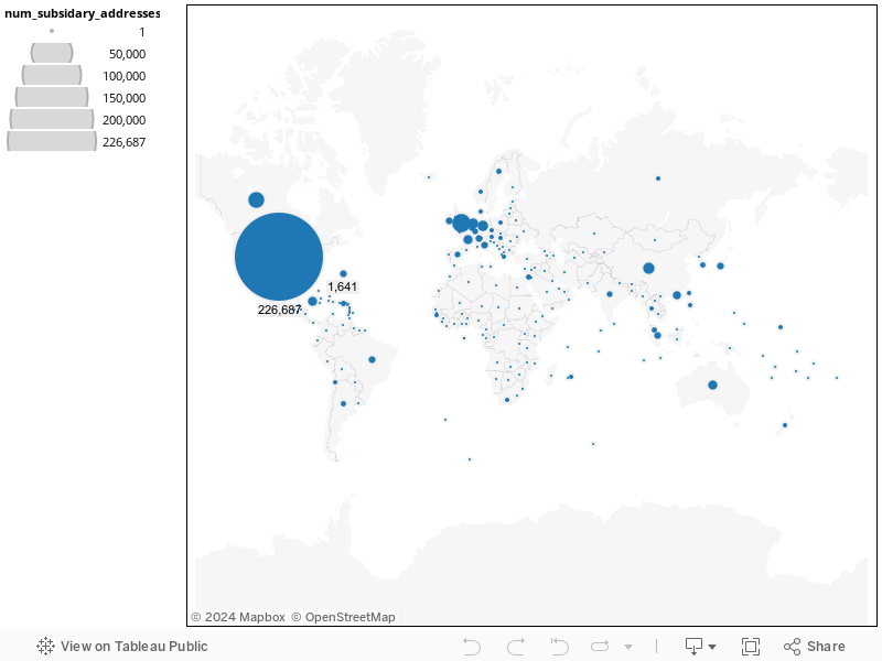
I think the result from Tableau Public was by far the best viz, but the web part is powered by somewhat sketchy tech. But it is really great that it allows displaying the values a proportional area circles. This helps a lot dealing with the data range problem. You can see the big values, and the little values are only a little distorted
Tableau is structured as a desktop application with the ability to export visualizations and datasets to a free Tableau-hosted web service. This means that using it requires downloading a Windows only application. That part went smoothly, but then to get it to connect to the server, I had to search on help forums for discussion. I then had to turn on Internet Explorer and change a IE security setting before Tableau could connect. But once I got it working (the free version), I found the application very smooth and elegant. I was able to figure out the data loading, geocoding, etc. without referring to any documentation. Publishing to web was easy. But once the app is embedded on my page, it takes a very long time to load. The system they've designed for interactivity doesn't rely on an special technology (other than JavaScript) and should be widely cross-browser compatible. But it doesn't use web technology very efficiently. The app sends Ajax requests on each mouse-hover, and it has to ask the server to redraw and reload an image for each mouse click, which must be horrible on low bandwidth connections (also makes me worry how their servers will perform under load).
Overall, the annotation and other features of the Tableau application are really great, significantly better than the other examples I looked at. But the non-free version (which you need if you want to save your work locally, connect to databases, etc) costs $800(US). I think this would be a fairly good solution if I was already a whiz at Excel, wanted something that feels similar (actually, I think Tableau's UI is much better) but is focused on viz will let me publish to the web. Hopefully they'll keep working on the web tech part.
Google seems to have several solutions in various stages of development. The example above uses the Google Chart API (aka Image Charts). It was fairly fast to figure out, but required reading some docs and a little trial and error to construct the appropriate URL. All the data in the chart is passed in as a single long URL. It loads very fast on the page. This version doesn't have interactivity, but claims to be able to generate imagemaps so in theory a developer could extend it to permit mouseovers etc. Problem with this kind of "filled-area" view of regional data. is that the US dwarfs all the other countries in this example, so the color range is not useful. You can only distinguish the US, countries with no data, and everyone else. There is also the common visual distortion caused by countries having different size and non-contiguous areas. For this reason some people prefer Cartograms for these types of viz).
This version is Flash based. I'm not fond of Flash because it is bulky, proprietary, and doesn't always play well on linux platforms or certain wildly popular devices beginning with the letter "i". But most people still do have flash installed in their browsers. But this map example loads and runs very quickly (contrast with Tableau!) and has very nice interactivity. Since the mouseovers allow you to see the values, it overcomes some of the problems of the static filled-area chart above. Had to read some docs, copy-paste code examples, and do a bit of find-and-replace to format the data as a JavaScript array to embed in the HEAD of the html page. So you have to know a little bit about web programing to get it to work, and adapting it for a blog would be a challenge. This is supposed to be able to do data as geo-positioned points as in the Tableau example, but I kept getting data truncation warnings ('tho its the same data that it is displaying now) and it seemed to spawn a runaway geocoding process. So it seems like its still a bit buggy.
Loved the idea of being able to just load the viz data in Google spreadsheet,and was also trying get around the bug/issue that was forcing me to use the area chart above, but had to give up on this one. It kind of worked, but took a deadly 3-5 minutes to load. It also scaled up all the small dots and despite the variable being labeled "country", it was messing up the geocoding. "CA" was showing as California instead of Canada. Maybe there is a way to give better instructions to the geocoding? Maybe Google will speed up the querying? I also tested the Google Spreadsheet mapping widget. It worked ok, with similar functionality to the geomap, but when I embeded it in the page, the content was overwritten with a second copy of the Tableau example. Namespace collision? Not sure if that is Tableau's fault, Google's, or mine.
The ManyEyes web UI for loading and cleaning the data was very nice. The embedded viz is Java based, so it is also slow to load (once you click on it), and feels a little odd and poorly integrated with browser. Uploading and generating the map was very easy. But I couldn't figure out how to set colors at all. Not all country names matched up correctly, some are missing from the map, like the UK tax havens of Guernsey and Jersey.
DOA. Swivel went out of business, plunging into the deadpool in July of 2010, and apparently taking their servers and data with them. Thereby highlighting the dangers of having remotely-hosted apps. This is an issue with all the services I tested: having someone else host the code and tech is great, makes everything simpler, but also means that future is out of your control.
March 2011. I'm adding OpenHeatMap after getting a tip from the developer to try it out. I'm very impressed. It only does maps, but has a nice step-by-step process for loading data. I gave it the url to the google doc with the data, but it also accepts CSV uploads. It correctly flagged and gave warnings for the ISO country codes it didn't recognize. Using the default version it produced the map in Flash and the iFrame embed code, but claims to do HTML5 Canvas as well (tho for me it didn't work in Firefox). In short, OpenHeatMap may be the easiest to load data into of the projects I've tried so far. It also seems to accept a wide variety of geographic names and IDs. I just wish it would also do circles instead of just the shaded-area maps.
I'd love to hear about other projects people have used. Projects like prettymaps seem like they will be very powerful and flexible, but maybe still require a higher level of web development skill.