David Wolber passed me a version of the SF Ethics Commission campaign finance data that he used to build the OpenCampaigns.com website. I did a quick pass of name and id matching for organizations and committees to resolve some of the data into a relational form. In the following examples, I am only using the "Form A" data- the amounts each committees said they received. (Information on payments and loans is also available, but not included in these maps). Only the contributions that are not from individuals are shown (to keep the network from getting too crowded)
Please remember this is a first pass through the data, so it is likely not everything is matched correctly. I'm not making any claims yet that this is actually useful. It appears that there are some divisions and structure in the networks, but I don't yet know enough about the details SF politics to understand if the positions make sense. (If you do know, please email me or comment on the blog post) These maps are only looking at a very, very specific kind of relationship (disclosed campaign contributions) between organizations so clearly do not capture the full richness of the alliances that make up city politics.
Contributions among San Francisco ballot measure and candidate committees and organizations.
Layout is multi-component KK in SoNIA, Areas of nodes are proportional to total dollar amount received in 2008. (I'm assuming the data is not complete, as it is still 2008) Ignores contributions from individual donors. Mouse over or click nodes to view labels
- Blue nodes are Committees (both candidates an propositions), green nodes are "Other" (mostly companies)
- A link is drawn when money was reported changing hands between nodes, darker links mean more money.
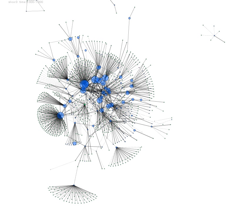
Interesting things to note:
- SF Chamber of Commerce located in center (small green node)
- Most of the fund raising was in the cluster of Supervisor races in the upper middle
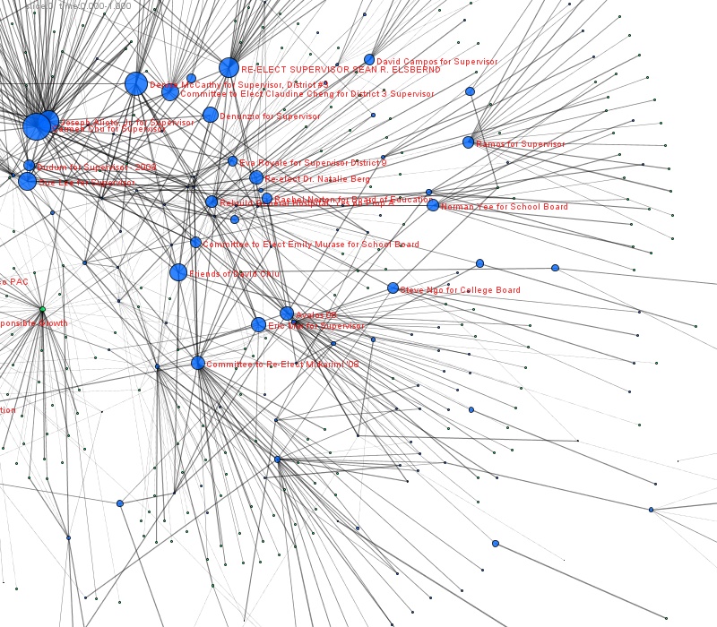
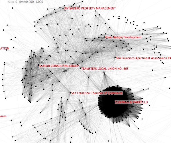
Close up
Zoomed in on a smaller portion of the net, with a few labels showing. (in case the mouseovers don't work in your browser in the other views.)
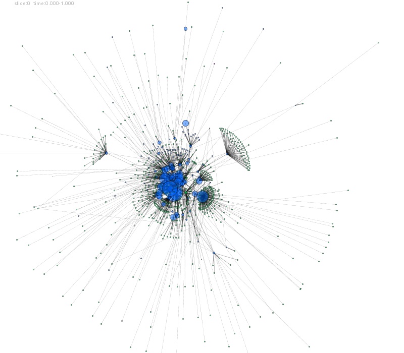
Same network, but tie length proportional to contribution amount
Using the weighted ties means that nodes that give a lot of money will be much closer together than those that give a little. (Note that most nodes land in different places than the other map.) Makes some of the structure clearer, but also compresses all the "heavy" organizations into the middle. Interesting to see a bunch of the radical/progressive community orgs (Coleman Advocates, SF Community Land Trust, PODER, somewhat isolated out on the left, not rasing nearly as much money or as well connected as some of the more centrist orgs. Way on the other side is the Building Owners and Managers Association, Zepher Real Estate, and friends. ('Tho we have to be careful about interpreting too strongly as some of this positioning may be a result of chance in this particular image. Need to do some real analysis...)
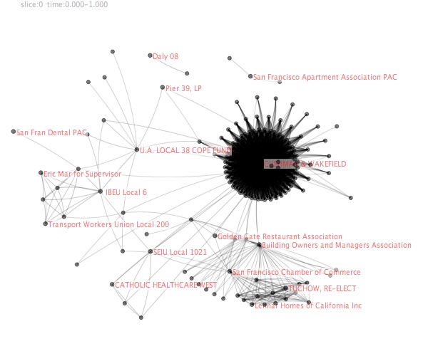
Co-Donation (update)
Ran a few more networks. These are "co-donation" networks, so a tie is drawn between to organizations if they both give to the same organization. Or in this case, give to more than one common organization. It is a way of looking at "allies" - groups are linked if they have similar giving patterns. Lengths of ties are proportional to number of donations in common
Checkout the crazy hairball of tightly linked developers!
Co-donate closeup
Co-donate core
It is also possible to tighten the tie criteria to show more significant relationships. This simpler network shows ties between orgs that give to more than 5 identical organizations. (no mouseover)
Thanks to David for providing data and getting me moving on this, we'll see what we can come up with to improve and make it useful. (As always,thanks to Greg M. for perl, javascript, and MySQL help.) Perhaps if we locate some funding we could make it more like http://oilmoney.priceofoil.org...
- Skye Bender-deMoll skyeome.net 11/26/08