
Its not what they say during the campaign that counts…
..its what they do in office. The nice thing about politicians is, a lot of what they do is a matter of public record, increasingly available on the internet for free. Wouldn’t it be great if ordinary people had the tools to make this political landscape visible?
I’m posting here some examples I’ve come across of intriguing maps and representations of political data. Mostly these fall under the broad heading of “mapping congress” based on data available from the THOMAS db of congressional record.
Committee Interlocks
I found a nice preprint in arXiv that explores the hierarchical relationships formed by the pattern of overlap of Representatives in committees:
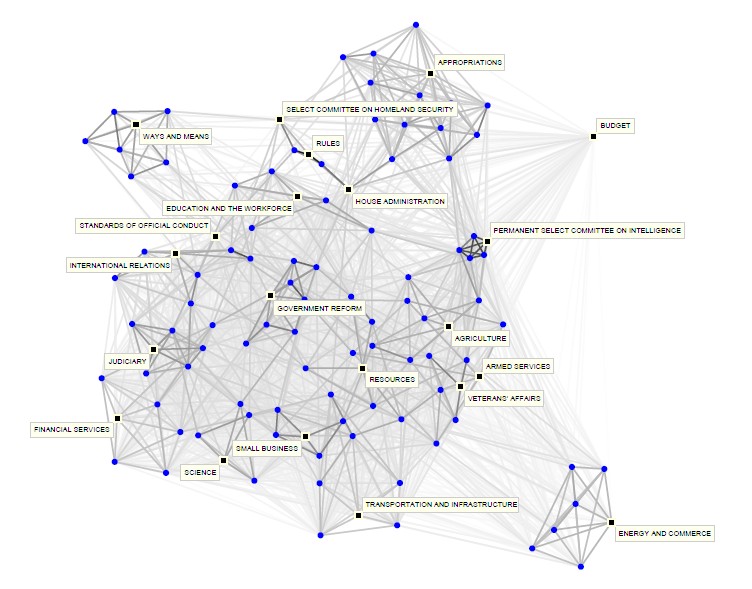
Network of committees (squares) and subcommittees (circles) in the 107th U.S. House of Representatives, with standing and select committees labeled. … Each link between two (sub)committees is assigned a strength equal to the normalized interlock. … Thus, lines between pairs of circles or pairs of squares represent normalized degree of joint membership between (sub)committees … and lines between squares and circles represent the fraction of standing committee members on subcommittees.
- Porter, et al (2006) “Community Structure in the United States House of Representatives” arXiv:physics/0602033 [PDF]
An alternate color-coded version for the following year:
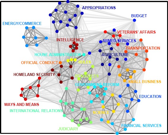
..Network of committees and subcommittees in the 108th U.S. House of Representatives, color-coded by the parent standing and select committees. … with link strengths determined by normalized interlocks. Observe again that subcommittees of the same parent committee are closely connected to each other.
(Both figures are drawn using a variant of the Kamada-Kawai spring-embedding visualization, which takes link strengths into account)
The paper mostly explores various techniques for measuring and assessing community structure and comparisons of the resulting dendograms. They claim to be able to detect changes in hierarchy resulting from the 1994 elections.
SVD of roll call voting
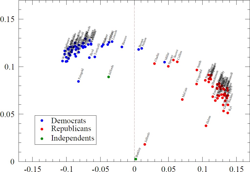 Porter et. al. also examine the “extremism” of committees’ members by doing SVD analysis of roll call votes. As I understand it, the Representative’s voting vectors are stacked into a matrix. Computing the Singular Value Decomposition of the matrix makes it possible to find a projection of all the vectors into a few dimensions (“eigenvectors”) that preserve most of the information. (I realize I’m confusing this with PCA, but I still have trouble distinguishing them…) When the data is plotted against the first two of these dimensions, points that are close together indicated representatives with very similar voting records. In other words, the axes of the plot are not directly interpretable, but certainly seem to express something about partisanship.
The roll call analysis technique has been around for a number of years, most authors seem to cite Keith Poole and Howard Rosenthal as fundamental authors. There is an interactive java software VoteWorld for browsing and animating US and EU roll call data, tho the positions don’t seem to update vote by vote.
Rollcall Hierarchical Clustering
 Aleks Jakulin at the Jozef Stefan Institute in Slovenia has an elegant Data Mining in Politics website. He shows a number of innovative ways to analyse and visualize roll call votes from the 2003 US Senate in order to understand some of the underlying structure. See the working paper:
- Jakulin, A. Buntine, W. “Analyzing the US Senate in 2003: Similarities, Networks, Clusters and Blocs.” [PDF] (Submitted.)
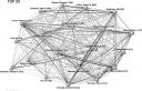
The dendogram example here demonstrates the patterns of clusters and blocks.
My understanding of how the figure was created is that each senator is assigned a vector where each element indicates their position on a roll call vote. The similarity (actually distance) between Senator’s vectors are computed and fed into an agglomerative clustering algorithm to compute cluster membership and strength. So the lower the tree level at which Senators names are joined, the more similar their voting record.
The Republicans and Democrats are clearly separated, but there are also some strong internal groupings within the parties. Alek argues that:
Each bloc can be interpreted as a single vote which is replicated several times, through its bloc members. Thereby, we can interpret a bloc as a single voting “super-senator”, but with a weight proportional to the size of the bloc. It turns out that A and B are most influential, D does make an impact sometimes, and E quite rarely. Republican blocs, especially bloc B, were more cohesive than Democrat ones.
Bill Co-Sponsorship networks

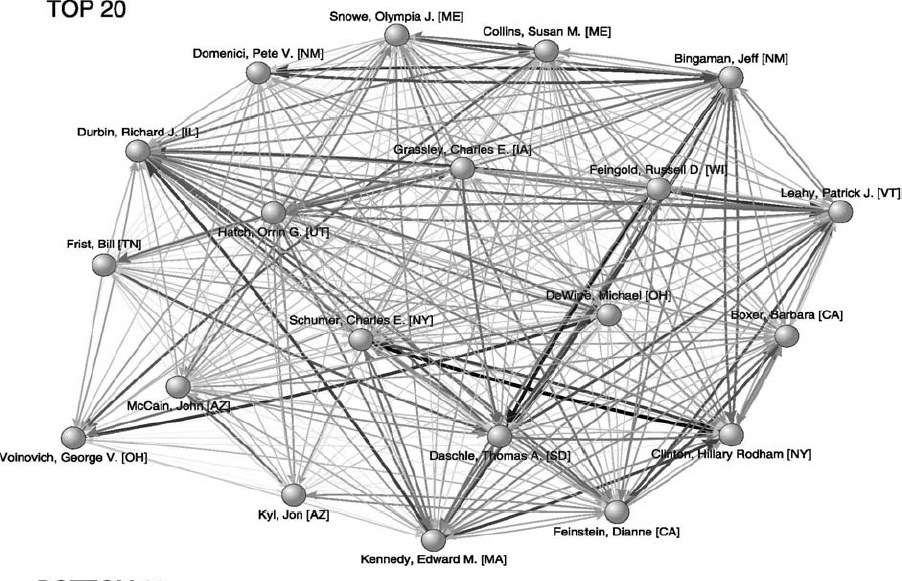
Fig. 4. Strongest weighted cosponsorship ties in the full Senate network, 1973–2004. Note: Size of each vertex is proportional to the Senator’s connectedness score, the width of each arrow is proportional to the weighted quantity of bills cosponsored wij (values of wij < 10 not shown) and vertices that represent the top 20 Senators are identified by name. Figure drawn using Kamada–Kawai algorithm in Pajek (de Nooy et al., 2005).
James Fowler has been doing some nice work with (transformed bi partite) networks in which links between politicians are defined by co-sponsering legislation, relating measures of connectedness to voting outcomes in roll call data. After seing the figure of the co-sponsorship links among the 20 most connected US Senetors in the (2005) working paper, I was going to sugest that it might be more interesting with some links threasholded out, as it is very highly connected (like many co-occurence networks), that seems roughly what was done in the Social Networks Paper, tho over a much longer time period.
 Fowler, James (2005) “Who is the Best Connected Legislator? A Study of Cosponsorship Networks” Society for Political Methodology working papers archive. [PDF]
 Fowler, J.H. (2006) “Legislative Cosponsorship Networks in the U.S. House and Senate”, Social Networks 28 (4): 454-465 [PDF]
Geo-coded campaign contributions
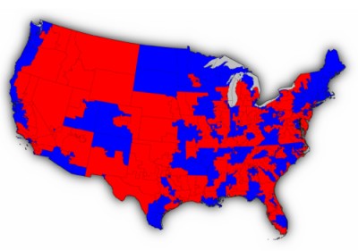
Tho it is more a map of the spatial distribution of political support and influence than of a behavior or issue space, Fundrace.org gives an elgant interface for exploring the FEC database and finding out how a region voted with their $.
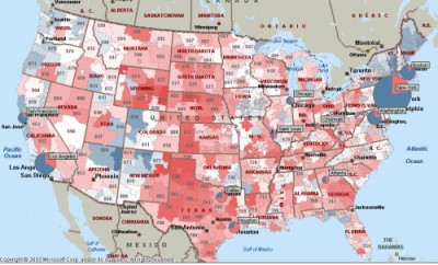
Interesting to compare with a map of the election returns (first is by 3digit zip code, the second by congressional district…
Co-Recipient Networks
The reverse would be to explore who is contributing which candidates. Which I think is pretty feasible. Here is my own preliminary example, a draft network of campaign contributions But I just found a recent draft paper by Suzanne Robbins and Maksim Tsvetovat that takes a preliminary dig into the FEC data for the 2000 elections cycle.
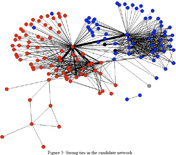
- Robbins, M.S. Tsvetovat M. (2006?) “The Structure of Interest Group Networks: A First Cut Using PAC Contribution Data” [pdf]
Figure 5 shows a plot of strong ties (weight > 1000) among 2000 congressional and presidential candidates. The plot is a strong dual-core pattern, with a heavy centering on presidential
candidates George W. Bush and Al Gore
I belive in this image tie weights are counts of co-donors, not total $. (I think they got the data from ICPSR archive, not sure if they cleaned it themselves) To me, the interesting thing is the very strong linkage between Bush and Gore, which would seem to indicate that there are LOTS of groups who are hedging their bets by contributing to both. Also, the group of democrats who are getting contributions from groups also giving to Bush. Who are they? Is the lack of a corresponding group of red nodes an artifact of the thresholding, or the time cutoff? If the data was cross-linked to voting, would we find that these “dual-funded” dems behave differently?