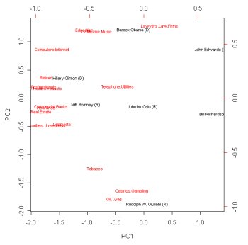
I’ve been thinking for a while about using a methodology called Principal Component Analysis (PCA) to create visual comparisons between various political candidates. Finally stole a few minutes to give it a shot using industry sector contributions to the current presidential races.
The basic idea is that givin a list of values for each candidate (in this case the totals raised in contributions from various industry sectors) a PCA will produce a plot where the most similar individuals are placed close together. It is a way of collapsing lots of dimensions into a few. In this plot the dimensions are labeled in red, and candidates landing close to a label are receiving more from that source than their competitors are. The This is still a draft of course, but notice how Rudy lands down with “Oil & Gas” and “Casinos, Gambling”. Makes Obama look practically saintly, up there with Lawyers, Education, and the entertainment industry. Also note that this does not produce a strict break between the Dems and Repubs, tho one could draw an approximate dividing line.
Methods
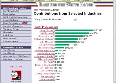
I don’t know a great deal about PCA, so I’m very open to suggestions on how to do this better. I used data from The Center for Responsive Politics’ opensecrets.org site. They take the funding reports filed by each candidate to date (April 2007) and provide a breakdown of contribution totals by industry sector.
Since I don’t have access to their DB (‘tho the underlying FEC data is available online for free) I copied and pasted until I had a vector for each candidate, giving contributions from each sector
Candidates Lobbyists Casinos/Gambling..
Hillary Clinton (D) 168050 39650
John McCain (R) 147850 20650
Mitt Romney (R) 93874 2100
Rudolph W. Giuliani (R) 82650 94900
Christopher J. Dodd (D) 59750 47800
Joseph R. Biden Jr. (D) 48750 0
Barack Obama (D) 29079 0
Bill Richardson (D) 23400 21600
Duncan Hunter (R) 15250 0
John Edwards (D) 12950 0
(etc.)
I loaded this data into R and used the prcomp() and biplot() commands. The main feature that was immediately apparent is that many of the candidates just had much less cash. I zoomed the plot in on the main candidates so they could be seen more clearly. But really there should be some kind of normalization strategy, or a better measure of comparison between the candidate’s vectors ( I believe prcomp PCA is using SVD correlation matrix? I’m always a bit confused between PCA, Classic MDS ,etc)
Anyway, the result seemed reasonable enough that it is worth pursuing, finding out more about the methods, deciding what attribute are worth including in the vectors. And especially tracking over time…


