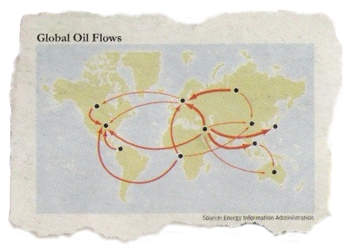
 I found an interesting Chevron advertisement inside the back cover of the July 2007 issue of Harper’s magazine. Captioned “There are 193 countries in the world. None of them are energy independent.” it depicts an open notebook with clippings of a number of graphics and charts showing information about energy interdependence.

I was particularly fascinated by the world map in the upper center, showing flows between selected countries in the world. It has a very small caption giving the source as the Energy Information Administration.
The EIA says:
Thank you for your inquiry to the Energy Information Administration. The only data that we can provide on world trade is located on our website at http://www.eia.doe.gov/ipm/imports.html and also at http://www.eia.doe.gov/emeu/international/oiltrade.html, View the link near the middle of this website page “World Petroleum Trade, All Countries, 2004 (Thousand Barrels per Day)”.
For some possible additional assistance, you may want to try contacting the International Energy Agency at www.iea.org or at 202-785 6323.
On the EIA’s website I was able to find a great deal of information about US energy imports and exports to various countries and regions, but was unable to find data broken down to give imports or exports between the specific countries in the figure. (i.e. the implied trade between Saudi Arabia and Norway). So it isn’t clear where the data for this figure came from. Was it derived from other sources, or from Chevron’s internal numbers? (Not surprisingly, Chevron did not respond to my inquiry. ) Maybe Norway stands for an aggregate of the EU? Or is the figure meant only to be illustrative of the concept and thus not based on actual data? (the power of Chevron’s “Human Energy” at work?)
Another odd thing about the figure is that to me it provides a very good example depicting the US’s extreme energy dependence, quite contrary the the goals of the ad. In fact, if we believe the map, the US is entirely dependent on imports, and Saudi Arabia is an amazingly crucial exporter. It also suggests one reason why we care so much about what happens in Venezuela…
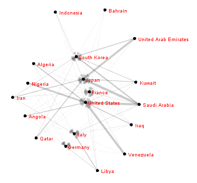
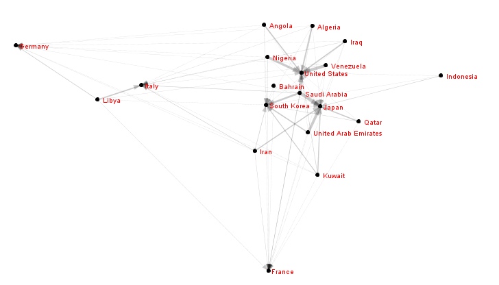
But anyway, I was eventually able to find some data on the OPEC to OECD exports and produce some network maps of my own – ‘tho without the geographic positioning.

These networks are for 2006. At first glance it seems like a classic core-periphery structure, but that is partially an artifact of the fact that the data is essentially bi-partite – I only have import data for the OECD countries, so if the OPEC countries are importing or trading with eachother, it wouldn’t show up here. The second version takes the volume of exports into account in the positioning calculations, so more oil flow means the nodes are closer together.
These maps lack the immediate intelligibility that the map underneath the Chevron version gives, but includes much more data. In these maps Saudi Arabia appears even more central, and the US’s role seems not tremendously different from S. Korea and Japan, tho’ each seems to have different sets of ‘client’ states. Good news is that this data is longitudinal, so it would be possible to make a movie and show changes in relative positions over time. (Hopefully we wouldn’t see such a strong US-Iraq tie during the embargo period..) I need to find time to move the data into the right form. And it would be great to get comprehensive data on international oil flows, must be out there somewhere…
Also, Chevron aren’t the only folks doing network viz. The DC watchdog group Oil Change International has been developing network related stuff as well, watch for it soon

