Curiosity about the “shape” of social structure is one of the main factors that got me involved in network visualization in the first place. How “clumpy” and “clique-y” are the patterns of social contacts around me? Are my groups of friends and acquaintances segregated by interest? Institutional membership? Race? Geography? If I could see a network map of the social contacts of the people in my geographic neighborhood, would the divisions of class, language, and activity be apparent? How would it impact how news and information move through a city or a region?
Visualizing this kind of data is a challenge, but the biggest challenge is usually collecting it. How can you get relationship information from thousands or tens of thousands of people? Is it even possible without huge NSA-wiretap-sized invasions of privacy? What kinds of relationships definitions should be considered to construct such a map? Friendships? Communication ties? Facebook links? All of these networks presumably would highlight different aspects of social structure. And some of the data is starting to become available, either because people are recording all kinds of information about themselves on the internet in electronic form, because of huge time investments in academic studies, or the release of data from large institutions and corporations that collect it for various (and occasionally nefarious) reasons.
Below are a few small-scale examples I’ve come across that struck me as steps in this direction, that seem to give a little peek at what the texture of the larger structures might be.
Phone Calls
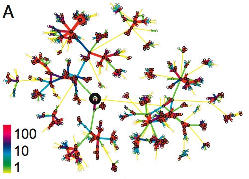
 The first image (above) is from a paper in PNAS by J.-P Onnela (et. al) titled Structure and tie strengths in mobile communication networks. It shows fragment of a network of reciprocated mobile phone calls among people in an undisclosed country. The links are color-coded to indicate how many calls were made during an 18 week period. (More specific info about the data here.) The network fragment in the image was extracted from the overall phone call network by selecting an individual at random (dark circle in center) and tracing out six steps into the surrounding network. It seems to show very tightly connected clumps linked through much weaker connections.
Personal Data
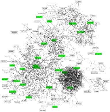
Toby Segaran’s blog post about personal data integration includes a nice network map he constructed using
… my September phone records, my email history, my contacts, my calendar and my Facebook friends (via the API, not something sketchy!) …
The network layout shows only the indirect linkages, as his ties have been removed to make the network visually clearer.

This network also shows some degree of clustering and segregation, he points out that his family is the only non-connected component, and the various tighter clusters correspond to various work and social area of his life.
Friendship Ties
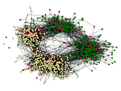
A colleague of mine, James Moody, has published a several papers examining the structure of friendships and romantic ties in US high schools. In this image [via VC, via M. Newman node color indicates race. The network shows pretty strong racial division, and also a top-bottom division apparently between students in the high school and middle school. (The paper includes images of romantic ties among students.) I believe these data were collected as part of large scale studies of adolescent health.

I find all three of these images very interesting because, even though the densities, tie definitions, and sampling techniques vary, it seems as if there is something qualitatively similar about them that I can’t quite pin down. Perhaps because they all involve some form of social ties between individual people?
 I would be curious to hear about other, larger, more community sized network studies and publicly available data sources, such as the friendship network in James Fowler’s NEJM obesity study…

