
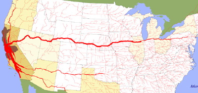
Found this fascinating .gov site that gives visual maps of the freight flows between various cities in the US. Image above is just truck flows from SF/Oakland, but they have for entire states as well. Data is from 1998, most Department of Transportation sources . Also includes similar images for maritime flows and links to commodity flows data sources. Neat to be able to see the distribution network of dependencies connecting the regions like arteries or roots. As if each city extends its transit tendrils to other cities to gather and exchange the “nutrients” (products) it needs to survive.
The Center for Urban Pedagogy shepherded a collaboration to produce a poster-document that highlights the fragility and “choke points” in the freight network.
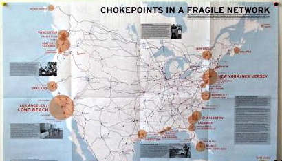
The Cargo Chain is an organizing tool for longshore workers that shows the players and pressure points in today’s globalized shipping network. How do commodities get from factory to shopping mall? Who really has the power to move today’s global economy? This publication was produced through a collaboration between the Longshore Workers Coalition, Labor Notes (a quarterly journal of labor journalism and research), cartographer Bill Rankin, and the graphic design office Thumb.
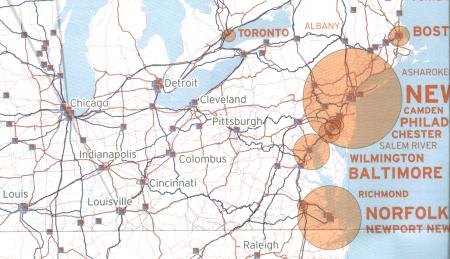
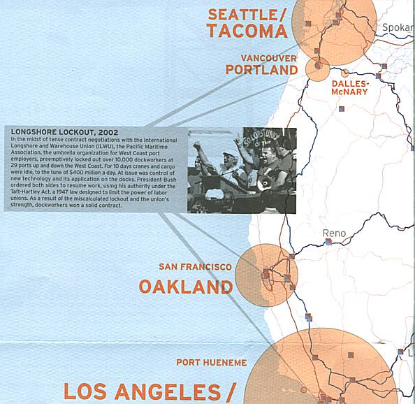 The map also include graphic call-outs highlighting specific historical strikes and labor disputes at strategic locations, and icons marking the locations where freight can transfer from rail (blue) to trucking (red) routes. The reverse side gives a global context for US-bound freight flows (wow, Singapore and China are huge!) as well as a narrative tracking the shipment of a newly-assembled iPod through the cargo chain.
The electric power grid is another example of this kind of network of flows embedded in geography. It is also somewhat fragile (blackouts) and subject to manipulation (electric power price scams).

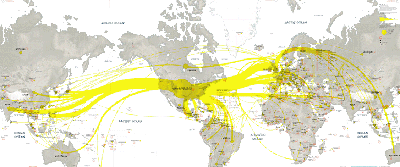
Although I usually think of the internet as a network-space or non-geographic topology of relationships between pages connected by hyperlinks, at some point the packets of information need to flow through a very different physical network of cables or satellite links. TeleGeography has created a lovely map of global internet traffic flows between regions.
They also have nice maps of submarine cables, the infrastructure that supports these flows the same way the highways and rail networks support the freight flows. I think it could be argued that Information Technology workers hold strategic positions in these networks the same way the Longshoremen do for shipping — if IT workers could ever set aside their Libertarian/Individualist tendencies and organize…
 And finally, a great example from a report on UK interdependence produced using the FlowMap visualization algorithms for routing the network of edges. The paper includes a nice image of migration to California as well as some international trade flows.