
The main conference on Social Network Analysis was is in San Diego this year, so I decided to make a trip down. Was nice to step away from the screen and see old and new faces from the far-flung research community. Amusingly, the conference landed in the middle of spring break celebrations, so there were bearded academics wandering geekily around in crowds of drunken sunburnt 20-something revelers.
 I gave a presentation at the very tail end of the conference to demonstrate some features of the oilmoney website—including a presidential contribution movie, and bit of analysis on the data. Much of this will be familiar to anyone who has read these earlier posts, but the stat stuff is new.
Warning: the rest of this post is pretty geeky, read at your own risk ;-)
Tracing the Political Web: presenting campaign finance networks interactively on the internet
The following is an adapted and expanded version of the presentation I gave at Sunbelt XXIX on March 15, 2009 Thanks to co-developer Greg Michalec, Steve Kretzmann and Trina Zahller at Oil Change International. The development and data assembly (but not the analysis) of this project was funded by Oil Change.
Background
Although the site has been live for the past two years, I was interested in presenting at the social network analysis conference for a couple of reasons:
- There is a surge of work going on in the tech / non-profit / “transparency” sector to get government data released in useful electronic forms.
- Much of this data is sociologically relevant and could become a resource for researchers (many of whom are already curating related datasets) especially in the political science domain.
- These transparency projects bring to bear a great deal of expertise in data standardization and extraction, they frequently could use input from the relevant academic communities
- I think the technology behind this project could be very useful for researchers attempting to present and communicate relational data via the web.
Motivation for the Oilmoney project
 One of the things I enjoy about my hybrid role as a independent developer / researcher is the opportunity and necessity of doing relatively practical applied projects to pay the bills. This project was a collaboration supported by Oil Change International, a 501c3 / 501c4 (Oil Change USA) organization campaigning to facilitate a transition to clean energy.
Our goals were to:
-
Engage viewers in a relational perspective on “dry†campaign finance
data -
Raise awareness about the network of $ flows from industry and relationship to patterns
voting - Attempt to communicate relational thinking outside the SNA community
- Develop web-based network viz tools and technology that could be re-used in other projects
Where do the data come from?
More detailed information on the source and processing is available on the project FAQ. But basic core data are:

|
|


The raw data from the FEC includes all kinds of transactions for all Federal candidates, including loans, independent expenditures, etc. They are very complex to parse and work with, so the CRP does some normalization and categorization of contributions into industry sectors. We used all of their information for the Oil & Gas sectors, and matched it up with the other data.
Who gives?
When sum up all the contributions by company, we can clearly pick out the major contributors.
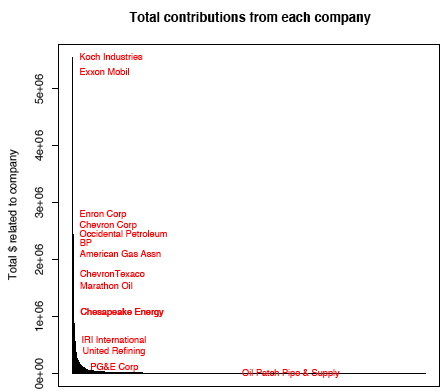
- 6500 companies in oil and gas industry
- Contributions from individuals (employees) and company Political Action Committees during 2000-2008 (ish) election cycles
- Oil & Gas sector contributed around $78 Million
- Distribution has a “long tail” (a few companies give a lot of $, a lot of companies give a few $)
Who gets?
When we look at it from the candidates perspective…
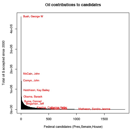
- 2200 Federal candidates:
55 Presidential
348 Senate
1471 House - Distribution is a bit thicker than companies (there are several hundred candidates who get a good chunk of change
- But remember, Oil is < 3% of total contributions to candidates!
Bi-partite networks + affiliations
The process of constructing the networks from the rows of data is quite complex. The basic concept is that we are creating directed relationships from “company” nodes to “candidate” nodes, using information from the candidate’s filings. In some cases the contribution comes from the company’s PAC, but we also count contributions from individuals when the individual is employed by the company.
A set of records like this…
| Filer | Contributor Name | Occupation | Employer | Amount |
|---|---|---|---|---|
| McCain, John | Irani, Ray R. MR. | Chairman | Occidental Petroleum Corp. | $4600 |
| Bush, George W | Hentschel, David A. MR. | Executive V.P. | Occidental Petroleum | $2000 |
| DeLay, Tom | Occidental Petroleum Corp (PAC) | $5000 |
… are transformed into a network graph like this:
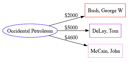
- We aggregate across individual’s “employer” field
- Data must be cleaned (companies do not have ids, have to match names)
- Very limited auditing by FEC
- “near”-bipartite network (there are transactions between candidates, etc, but we are not showing ’em)
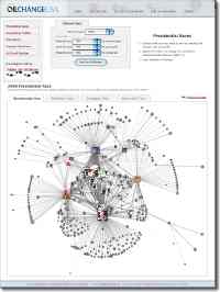
Oil Money drill-down demo
The oilmoney websites make it possible use this method to view lots of contributions and candidates at the same time. This demo doesn’t translate well into a blog post, but fortunately, you can try it yourself! ;-)
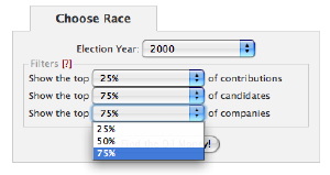
- Go to: http://prezoilmoney.oilchangeusa.org/
- Travel back in time to the 2000 election cycle
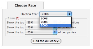
- Toggle between “parallel” network and tabular views of identical data
- Adjust the filters to show more than just the top quartile of big donors
- Explore the network with interactive popups on nodes and edges
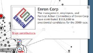
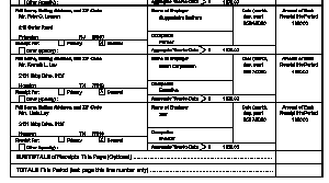
- Expand the tabular company view to show detail of each individual transaction (try to find Key Lay’s contribution from Enron!)
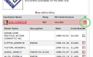
- Expand individual records to view the original FEC transaction receipt
Which ties should we count?
Contributions come in many sizes, should a $250 (the minimum reporting threshold) contribution from Joe Pipefitter be counted as much as $4600 (the maximum individual contribution to a presidential race) from a company CEO? or a $25,000 contribution from a company PAC? This plot shows all the contributions along the x axis, with the the amounts (compressed) on the y axis. The stair steps show where there lots of contributions of the same size.
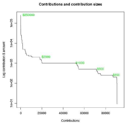
- Large contributions are almost always from important people in a company (CEO, VP, etc)
- Contributions from individuals are subject to limits
- Complete networks are too dense (at least for visualization)
- Some contributions are negative (candidates give money back)
- Default for viz is to “threshold” the network and only show the top quartile of contributions
Breaking time into chunks
Although in most of the plots we’ve been lumping together contributions from several election cycles, the contributions actually vary a lot–from a gusher to a slow seep. This plot shows how much money arrives each day. The orange vertical lines show the time points where we have voting data (discussed later).
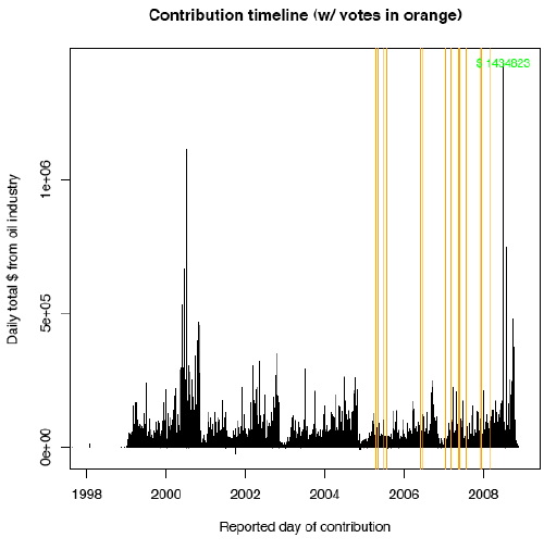
- Periodicity from election cycles, filing deadlines, and weekly cycles.
- Contributions appear more likely on some days than others
- 2008 data is not yet complete
- Unknown lag effects between (any potential) impacts of contributions on voting (or voting on contributions)
Animation of a contribution network
Coincidentally, we happen to have some software that makes it possible to look at how the relationships unfold in time by animating across a series of “slices” of the networks at subsequent time steps.
(you must have QuickTime installed to view this movie)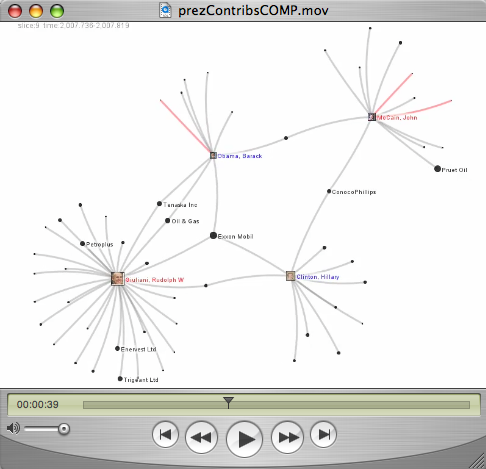
- Movie shows contributions to top Pres candidates 2007-2009
- Networks produced from monthly “bins” of contributions
- Red lines indicate returned contributions
- Animation produced with SoNIA (Social Network Image Animator) http://sonia.stanford.edu
If for some reason you can’t see the movie, here is the cliff-notes version:
- Giuliani starts out as the most-favored oil candidate
- Starting in 2008, he has to give back a bunch of money
- There are a few companies who seem to turn around and give the returned contributions to McCain
- Eventually settles down to just Obama and McCain, with the big companies giving to both
Money and votes correlations
Ok, now for the tricky stuff. How do we measure if money is actually influencing candidates decisions? Answer: We don’t. Like most social systems, the process is very complex, and many factors involved. Even if it is possible to establish a statistical relationship between money and votes, it is very hard to pin down what causes what. There has been a lot of research about the impact of campaign contributions in the legislative process in the political science literature, most of which I have not yet read. I was able to draw a few conclusions from what I did read:
- Researchers tend to find whatever effect they look for (perhaps because data is so complicated?)
- Establishing causality is really tricky
- A nice review A Meta-Analysis of Campaign Contributions’ Impact on Roll Call Voting (Roscoe & Jenkins, 2005) claims that, after including results of multiple studies, as many as 1/3 of votes show impact from contributions
So although I’m not gonna try to establish causality, the goal is to see if there is some kind of correlation between the amount of oil money a politician gets and their behavior towards the industry.
A basket of votes
In order to test for a relationship, we need some way of measuring a politicians alignment or support of the oil industry. For incumbent congressmen, we can do this indirectly by checking their positions on a set of relevant roll call votes. However, the actual intent of a bill can be difficult to decipher (riders, amendments) and the accuracy of the measure is of course completely dependent on which bills are selected to be in the vote “basket”.
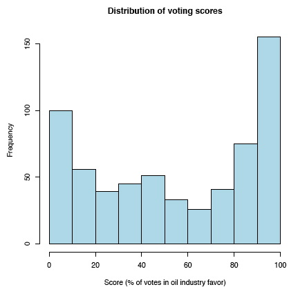
- Policy analyst selected 20 votes (bills and votes not the same thing)
- Bills cover energy policy, climate change, Iraq war
- Coded as % of time voting “with” oil industry
- Has a reasonable spread (bi-modal) but with some discrete sample issues (not that many votes)
Oil money vs. vote scores
Now that we have a score, we can plot a point for each member of congress, giving the score on one axis and the amount of $ on the other. (Because the range of values for the dollars, I used a logarithmic scale to compress it into a more normal distribution.)
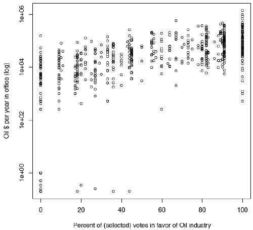
- Appears to be perhaps a gradual trend of oil-favorable politicians receiving more money
Welcome to the party!
But, if we add in the party of the congress member on the correlation polot, we can see an even stronger trend: Republicans tend to vote in favor of the oil industry. This may not be a surprising finding, as most votes are split almost entirely along party lines. The plot also suggests that Republicans (red) tend to get more money from the oil industry than Democrats (blue) do. (See if you can find the few gray independents in the middle…)
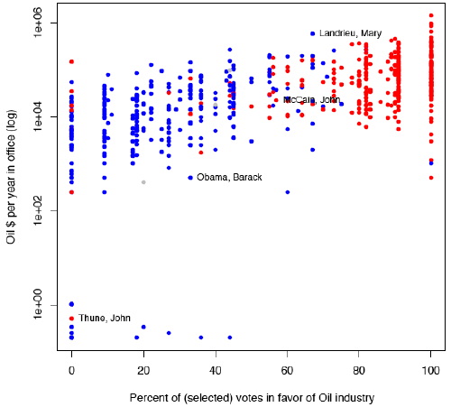
There are many possible explanations for this trend. Perhaps companies tend to give to their state’s representation, and the congressmen from oil-producing states happen to be Republican? Or maybe it has nothing to do with oil money at all, and it is just that oil-supporting candidates get more money overall, some of which happens to be from oil companies? Or maybe maybe the more “conservative” members have just been in office longer and had more time to stack up campaign funds?
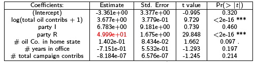
A crude linear model
For those who like numbers better than graphs, I tried to test out a basic statistical model by doing a regression in R. I’m sure there are much better and more sophisticated ways to do this, I’d love to hear suggestions. The model I tested proposed that perhaps the voting score was determined by a combination of several factors:
Vote score = log(total oil dollars received) + party + num oil companies in home state + num years in office + total of all campaign dollars
(I happen to have data on hand for the number of publicly traded companies by state and industry sector from another project..)
The model gave the following results:
 Residual standard error: 18.18 on 603 degrees of freedom (194 observations deleted due to missingness)
Assuming that I set it up right and I’m interpreting it correctly, this seems to say that it is highly likely that party and oil money both strongly predict voting scores, but party is a stronger predictor by almost a factor of ten. (Note: Toby Hocking points out that my interpretation of the magnitude (but not significance) of the predictors is wrong because they have different units. Thanks Toby!)
Vote table demo
As most people visiting the website don’t have scientific backgrounds, we can’t assume that they will understand a regression analysis (I barely do myself). So the choice was to display much of the same information in an interactive table. Also, as Oil Change International is non-profit, they were understandably cautious about presenting informtion that might make it appear that they were endorsing any candidates. They felt it was much better to present the data so that people could explore it and draw their own conclusions.
![]()
- Functions like an augmented spreadsheet, with $, vote scores, and positions on each vote
- Columns can be sorted by click on headers
Wait, what about network analysis?
Ok, you got me. I didn’t actually do any network analysis in this project. Yet. But I do have a few qualitative observations and things I’d like to look at.
- Node degree and dollars seem highly related (not so interesting)
- Core/fringe structure? (but it just because it is bi-partite…)?
- Net of party and voting, what predicts tie formation?
- Are regional / state interests more powerful events once “broad” donors are removed from the network?
- Explore time lags of network influence?
But did anybody learn anything?
It is very hard to asses the impact and utility of the site. Certainly we have some anecdotes like:
“OK, I had to laugh at that one, even if I am a Bush
supporter. He looks like a spider sitting in his web!”
–[blog comment in response to the prez 00 and 04 images]
We were able to get the technology working well, and in a fairly cross-browser way. We got positive feedback (especially from the design community), but also saw situations where or design did not communicate effectively at all. So was it worth all the work to present network data on the web?
Pros:
- People like faces more than numbers
- Having something to poke at initially more engaging that a research report
- Some bi-partisan appeal, maybe not just preaching to choir
- 83,000 unique website visitors over two years
- 500 stable incoming site links
- Two design-related print articles
Cons:
- Project cost: ~$35,000
- Lacks narrative to engage viewers
- People only spend a minute or two on the site
- Limited grounding in research / the non-profit had clearly desired outcomes before we started the project
- Networks not that interesting in terms of structure
- Legal environment way too interesting, triky balence between 501c3 (non pr
Next steps
Display tools
- Package up software for open source release. We are gonna release source, but if we could find funds to make the code more general, and to write documentation it would be much more useful.
- Define a format so people can publish networks as “self contained” web apps. This would probably have to be a funded project, but not a big one.
Continuing research (as time permits)
- Follow the real money (Insurance industry / Medical / Pharma)
- Are there researchers with stats and polisci backgrounds interested in working with this data?