
I had several conversations at the INSNA conference that made me realize it might helpful to blog some really short examples of lesser-known features and hard-to-remember tricks for the R packages network, networkDynamic, statnet, etc.
Continue reading Multiplex networks in network: an R example
All posts by admin
R package ndtv update + workshop + examples
Finally got the update to the R dynamic network visualization package ndtv 0.5.1 out the door and up on CRAN. This is part of the yearly flurry of statnet package releases (we also posted new versions of network, networkDynamic, ergm, etc, over the last week) in preparation for running workshops at the INSNA Sunbelt social network analysis conference. This year will be a first for me, we will be running a pre-conference ndtv workshop on 2/18/14, so I’ve been working to pull tutorial materials together.
One of the new experimental features in this release is a “proximity.timeline” function, a first stab at doing relationship timelines. The horizontal axis is simulation timesteps and the vertical dimension is geodesic proximity collapsed to 1D. Below is a proximity.timeline plot for the short.stergm.sim example object, showing a changing component with four isolates which eventually breaks into two components around time 20.

Continue reading R package ndtv update + workshop + examples
Multiple modes of flying flows
While trawling for interesting dynamic network datasets, I bumped into one about U.S. airport passenger traffic aggregated by Zachary Neal.. I lifted this image from his slides (p.9):
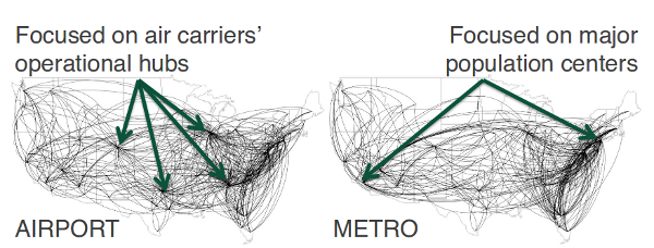
These data contain annual U.S. air traffic flow networks from 1993 to 2011. They were constructed from Bureau of Transportation Statistics’ Origin and Destination Surveys using the AIRNET program
What I thought was cool is that he constructs the network in two ways: one is the passenger flow between specific airports, the other is total passenger movement between metropolitan areas (if I’m reading his data correctly). He claims the first approach yields a hub-spoke network driven by airline hubs, while the second highlights travel between dense population areas. Both are derived from the same data. I think it shows how important it is to think carefully about how to construct networks that correspond well to the phenomena being studied. Are we interested in relative traffic between cities, or in the the actual flow of people (via roads, airports) between the cities? In hindsight, its obvious that these are very different networks (the first one for example should be nearly fully connected, right?).
I’m assuming that there is some thresholding going on in these images, ’cause the dataset he provides seems to have lots more edges in it.
Relationship Timelines
I finally had a chance to pull together a bunch of interesting timeline examples–mostly about the U.S. Congress. Although several of these are about networks, the primary features being visualized are changes in group structure and membership over time. Should these be called “alluvial diagrams”, “stream graphs” “Sankey charts”, “phase diagrams”, “cluster timelines”?
James Moody and Peter Mucha’s Portriat of Political Party Polarization (in the new Network Science journal) plots the network modularity score of structurally-equivalent voting clusters in the Senate co-voting network as they change over time. The lines show the movement of Senators between clusters over time.
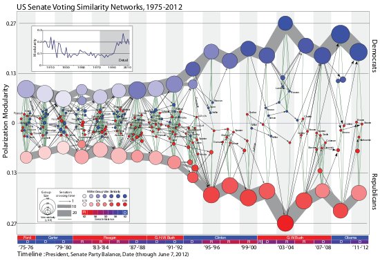
The figure maps this dynamic coalition network, one two-year Congress at a time. Nodes indicate structurally equivalent positions, scaled by number of Senators and shaded by their voter agreement level. In each period there are two “party loyalist†positions, anchored on the y-axis proportional to the modularity score. The y-position of other nodes—usually individuals—is based on the balance of their votes relative to these anchors. Positions are linked over time by identity arcs connecting each person to themselves over time, labeled to trace individual careers (the widths of arcs between aggregate positions indicate the number of people moving between them over time).
ndtv animation “live” at London Science Musuem
Dr. Michael White wrote to let me know about an exhibit / performance at a science museum that used a network animation produced with the ndtv package.
… we used QR codes and tablets to monitor the spread of an infectious disease throughout people attending the museum, and perform dynamic network visualizations in real time.
The article is a little vague about exactly how this worked, but it sounds like the visitors were given tokens to pass to each other, a few of which were labeled “infected”, and at various points they were scanned in by staff and the data used to update the animation of the transmission network? The animation is included in the article. Cool to see the software used in real life!
ndtv: network dynamic temporal visualization
The ndtv package is finally up on CRAN! Here is a the output of a toy “tergm” simulation of edge dynamics, rendered as an animated GIF:
[link to movie version a basic tergm simulation]
Continue reading ndtv: network dynamic temporal visualization
Immigration Lobbying Network
A great new interactive network viz showing the ties between bills and organizations lobbying U.S. Congress on the topic of immigration reform.
 .
.
The blog post about it gives their methodology and descriptive analysis. Really great work by Alexander Furnas (research fellow) and Amy Cesal (designer) at Sunlight Foundation!.
Continue reading Immigration Lobbying Network
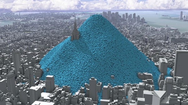
Carbon at scale
From the making the intangible tangible dept. Some nice work from CarbonVisuals. I’m not usually that excited about 3D geo rendering stuff, but this is elegant, simple, and compelling.
A single hour of NYC carbon emissions:
Carbon emissions associated with NYC public buildings:

broken link :-(
I think I need this one attached to my car keys. One Gallon of Gas:
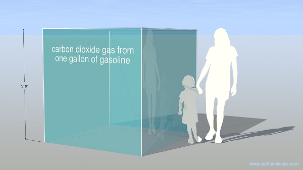
From the methodology document:
Take a typical room 20 feet x 20 feet x 9 feet. Only 400 parts per million of the air in the room is carbon dioxide, which doesn’t sound like a lot. However, that is nearly 11 US gallons of carbon dioxide, which sounds a lot more significant. 3.2 US gallons of that came from burning fossil fuels. If you show people that in every small room there is 3 US gallons of greenhouse gas that we have put there if begins to seem like a big deal.
I’m thinking maybe I should label three empty milk jugs and leave ’em in my living room to trip over, just so I don’t forget.
via infosthetics
Pleasantly Perusing the Paper Pile with Pivots

A nice UI for browsing a database of academic papers: Marian Dörk’s PivotPaths. It arranges papers matching a search term along with a sort of linked tag-cloud of authors and other keywords for easy navigation. All the interaction is really nice (try dragging a line between two authors to compare them!). Papers queried from Microsoft Academic Search. Find it interesting how looking at a different database for my standard search terms reveals unfamiliar sets of papers (my vanity queries turned up nothing in the viz, tho they do have hits in Microsoft Academic Search). Would be really cool if you could point it to google scholar also to compare coverage. I like that, even ‘tho it was built at Microsoft Research, it uses open web standards! (SVG, oog). Have we reached the point where the best way to publicize a new data service is to get someone to build a viz with it? Via infosthetics.
The Other Kind of Network Marketing

Oakland political economy journalist/blogger Darwin BondGraham has an interesting article about a court case that appears to reveal massive collusion between private equity firms to manipulate markets and cheat investors when doing leveraged buyouts (I think thats what “LBO” stands for?) of public companies. Darwin includes some network diagrams, apparently bi-partite networks of the major firms and their shady deals extracted from Dahl v. Bain court documents unsealed by the NYT. The document is a surprisingly riveting read, kind of like techno-thriller-horror script.