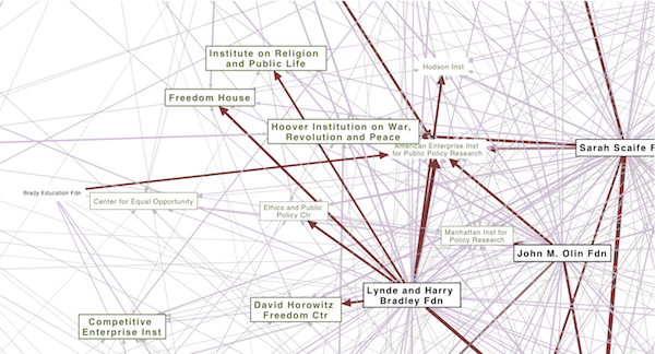
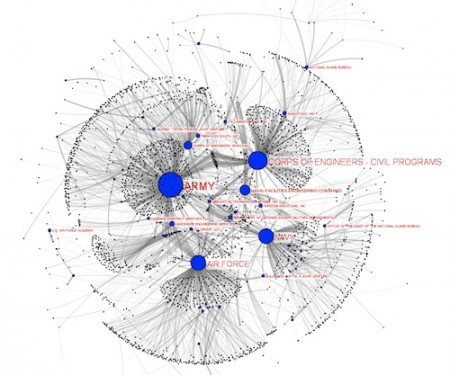
I’m interested in making political structures visible. Trying to put those half-realized connections and linkages into a tangible form–a map that we can point to. I recently located an online database of conservative funding relationships created by Media Matters Action Network. I was able to scrape the site and (with their permission) experiment with some network diagrams in pdf form to visualize the funding relationships among “angel investor” foundations and right-wing organizations.
Continue reading Angels of the Right v1.0
Many Brands of Bubbly Bottles and Cans
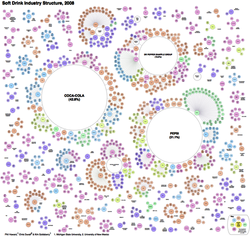
… but only a few owning companies. Another great study and diagram of brand ownership relations by Philip Howard.
…To visualize the extent of pseudovariety in this industry we developed a cluster diagram to represent the number of soft drink brands and varieties found in the refrigerator cases of 94 Michigan retailers, along with their ownership connections.
Although, according to the Soda vs. Pop map, since the study was in Michigan, maybe it should be labeled “Pop” not “soft drinks”? ;-)
JoSS Visualization Symposium 2010
The Journal of Social Structure did a special online Visualization Symposium with peer-reviewed network visualizations. A good format, a great idea, and some nice viz examples. Hopefully next time there will be more submissions.
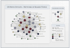 I thought that this map of overlapping topics between media outlets was a cool idea. The resulting network seems like a fairly undifferentiated core-periphery structure, which seems typical of a lot of topic-maps-as-networks I’ve seen. Does this reflect a property of media networks, or is this what topic maps look like? Maybe a threshold filter on the edges to then out weak (or strong) ties would reveal more subtle structure? I thought the blockmodel reduction of the network was a helpful summary. The model does seem to be backed by some substantial statistical work and
… “Results of the estimation indicate that both production volume and common ownership affect the topic overlap of news outlets.”…
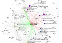 My submission was cleaned-up interactive version of the bill-endorsement network from MapLight data with click-through to bill summaries. The layout was produced using SoNIA (now with variable node label sizes!) and the MDSJ library.
US Social Forum Topic Network
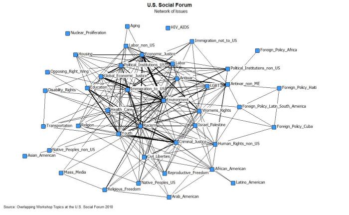
Michael Heaney and Fabio Rojas just released another great network map in a blog post. This one shows the co-mentions of topics (as coded by the researchers) appearing in the descriptions of panel discussions at the recently concluded 2010 US Social Forum in Detroit. The map functions as a coarse-grained representation of interconnectedness of the various topics, and presumably how important and relatively central they are to the activists and organizers participating in the forum.
Delegate Co-memberships
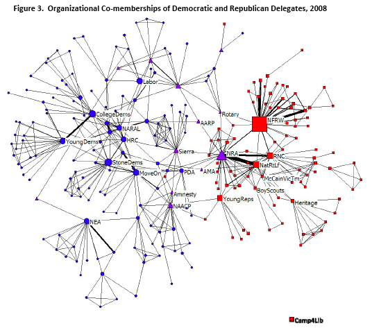
A lovely organization co-membership network graph of the delegates to the 2008 party conventions. From Networking the Parties: A Comparative Study of Democratic and Republican Convention Delegates in 2008 (Pre-print. Seth Masket, Michael Heaney, Joanne Miller, and Dara Z. Strolovich). The authors surveyed the delegates at the major party conventions about which groups they were members of. Nodes are groups, links indicate delegates who named both groups. Red only nominated by Republican delegates, Blue only Democratic, Purple = Both. The image gives a nice quick overview of the relative positions of groups, the paper gives more detailed analysis.
Interesting but not surprising to see the Sierra Club / NRA relationship, and NAACP / Young Republicans membership as well. I’m curious what the single red node is between Amnesty International and Sierra Club… Would like to see a version with all the organization names. Does this image match your intuitive sense of the relative political positions of the organizations named?
Caught in a bad hotel..
Political theater in the internet era. Who knew it could be so much fun? I like how the woman at the check-in desk cracks up when the singing starts…
Continue reading Caught in a bad hotel..
Talk at TransparencyCamp 2010
The Sunlight Foundation recently brought all of its grantees together so that each organization could learn more about what the others were working on. Since they funded the work on the CorpWatch API, I got to attend. They also invited folks to stay over the weekend and attend the TransparencyCamp, a 2-day “un-conference” in DC for folks interested in getting the government to be more open an responsive with its data.
I gave a presentation on the work we did on the CorpWatch API, and why I think it would be a good idea to develop a common standard id system for company and organization names. The talk was streamed live, and archived as well. I sound a bit jet-lagged ;-)
The slides from the talk are here (pdf).
I really enjoyed the un-conference format: participants basically shout out what they want to present or discuss and convince folks to come to their sessions. Got to finally meet face to face with the people who have been doing all the amazing work to provide the data we use in so many projects. Had some great discussions about trying to build some kind of larger project to create a common id system that various organizations could link to so that companies can be correctly matched and aggregated across datasets. Learned a lot. Was especially interested in some of the work being done internationally, seemed at time more pragmatic, less obsessed with the latest shinny new tech toys.
The Contractor Food Web: Visualizing the flow of Recovery Act dollars to defense contractors
Found a well-structured dataset on Recovery Act contracts at fedspending.org. Created a network map for the Awards funded by Department of Defense (except military departments) category. Also serves as a crude user interface to the data. Clicking on contractor nodes links to full record with information about the contract.
Would love to build something like this for the whole dataset, or for the TARP funds.
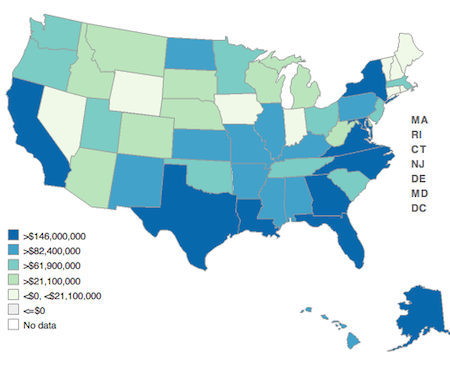
Fedspending.org already does some flash-based geographic maps to show which states the money is (initially) ending up in.
(click for interactive version)
UPDATE Feb 11, 2010
When working with the this data, I was very surprised to see a name I recognized jump off the screen. Nehalem River Dredging is small 2-6 person operation with a single boat based in my home town. Could they really be receiving a $47,150,000 contract with the Army Corps? Almost 50 million dollars!? That probably greater than the entire yearly economic output of the town. Since this data is known to have some highly-politicized problems (like the flap about the non-existent congressional districts) it seems like there may be some kind of error. My father called up the Port wheer the dredging is being done to investigate. Sure enough, they said there is a two decimal place error in the reported contract amount. It was actually $470,150. So I guess the message is take this data (which is self reported by recipients as I understand it) with a grain of salt, there is plenty of room for two-orders-magnitude errors to sneak in.
Feed & Seed
Phil Howard has built another corporate consolidation dataset, this one on ownership networks of seed distributors.
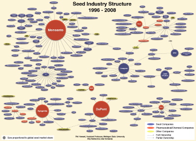
[click for pdf version of network]
New years entity resolutions

Just in case you think that entity resolution problems (matching up names appearing in multiple data sources, while not falsely assuming that everyone named “John Smith” is the same person) are purely an academic concern, I recently got an email from an airline announcing TSA’s new Secure Flight program and asking me to provide them with birth date and gender information when making a reservation:
Continue reading New years entity resolutions

