I recently was at a conference where the participants were asked to provide some keywords describing their current research. I standardized some of the keywords, and even made up a few for some of the participants who hadn't given any, resulting in a table of researchers initials and their keywords.
ST    "Climate change"

ST    "Adaptation strategies"

ST    "Sea level rise"

ST    Caribbean

ST    Canada

HL    Crew

HL    Gang

...
These keywords associations result in a relatively small network, without the kind of super dense connectivity which would make it hard to visualize. But this example also highlights an issue with keyword nets: they can be kind of arbitrary. If I was adding nodes, why not create a link for "MF" who does work mostly in the Caribbean but didn't list it as a keyword? Should 'eHealth' and 'Electronic medical' records be combined to provide a more accurate overview of how people's topics overlap?
The main challenge with network data is often wrestling it into the appropriate format for a specific tool. ManyEyes allows you to paste in the data in their data upload tool with each row describing a keyword association. That was very easy, the disadvantage is that there doesn't seem to by any way to specify the node properties.
Like all ManyEyes visualizations, the result is an interactive Java applet which they host and which you can embed on your web page. It allows you to zoom in, and click on nodes to hilite the connections. The drag to select an area to zoom in on feature is really nice, as is the search function. The Java takes a long time to load, but it seems work OK, ('tho on Ubuntu it crashed until I installed Sun's version of Java)
ATT's Graphviz project is one of the most powerful and flexible tools for rendering networks. It is used by many other software packages, has a great command-line tool, and even includes some web-based components, but isn't really set up to be used directly as a GUI application by users. Fortunately there are a few front end applications. After generating my initial .dot file for input, I used Glen Low's Mac Graphviz application to check the rendering as I adjusted various parameters and set the node coloring. It is then very easy to produce versions of the layout as PDF, PNG, or many other formats. But setting up interactivity would require a lot of programming.
At first I only had to do some minor find-and-replace text transformations to create the basic input file in GraphViz's .dot file format
Graph keywords {
ST -- "Climate change";

ST -- "Adaptation strategies";

ST -- "Sea level rise";

ST -- Caribbean;

ST -- Canada;

HL -- Crew;

HL -- Gang;

...
But if more detailed information about the nodes is going to given, the format quickly starts to get more complicated. (This is the challenge for a network data formats) I ended up adding node information create a fairly detailed .dot file in order to get the rendering I wanted.
Graph keywords {

graph [edgesfirst];

ST [style=filled, fillcolor=lightblue];

HL [style=filled, fillcolor=lightblue];

...

node [shape=plaintext, fontcolor=blue];

edge [len=3, color=lightgray, penwidth=0.5];

ST -- "Climate change";

ST -- "Adaptation strategies";

ST -- "Sea level rise";

ST -- Caribbean;

ST -- Canada;

HL -- Crew;

HL -- Gang;

...
The complete .dot file is here.
Google has a neat looking experimental GraphViz tool in their chart API. Basically, you can include a graphviz .dot file as part of the url, and they will generate the graph image for you. (You do have to escape the & and " characters in the .dot file to their html versions.) ...But there is a limit of 2000 characters in the url, and the file I'm using is around 3000. So it gets truncated and looks weird. In theory it should be possible to work around it using a POST request, but that would get complicated. Also, they have GraphViz's anti-aliasing turned off, so the images look a little "bitty". But seems like an option for smaller networks.
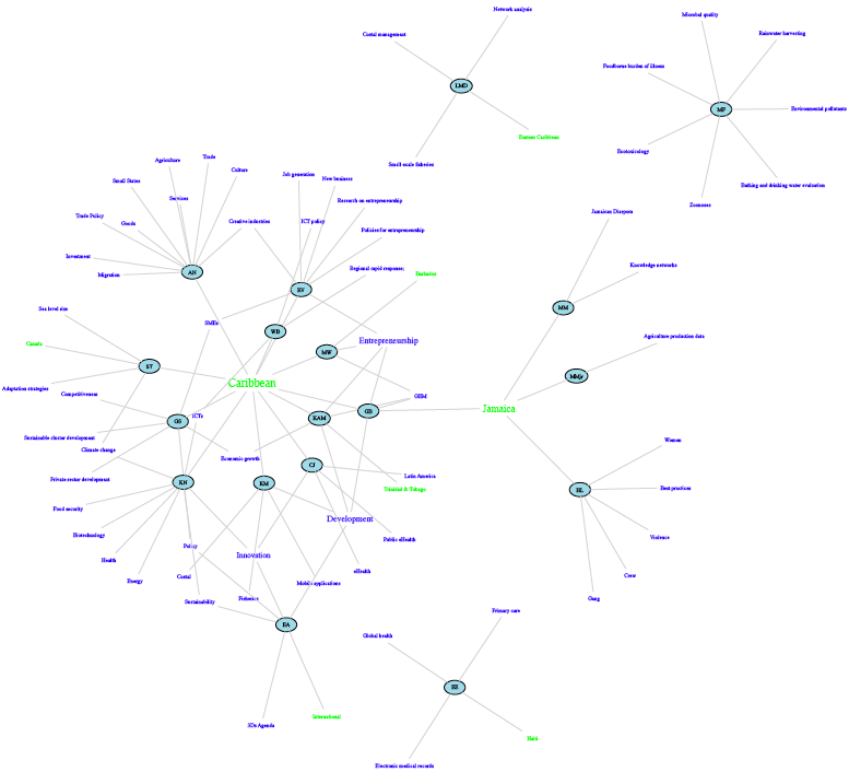
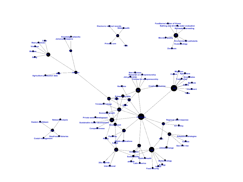
I loaded the .dot file for the graph in Gephi, did a layout, exported it as a GEXF file, installed GEXF Explorer on page following its instructions. Unfortunately, the GEXF file doesn't preserve the coloring options by default. Also, make sure to download the "demo_gexfexplorer.zip" file from github, I found the head of the branch to be broken, and to get the the mouse to work, you have to add the javascript mentioned here. Doesn't seem to be any way to specify scaling of the coordinate system, so it is initially stacking up all the nodes. Was able to fix it a little bit with some ugly find-and-replace in the GEXF file, but labels still not readable. Contrast to the network as it appeared in Gephi:
This does not yet seem like a mature solution. ('tho may be better than my code!). Gephi had some nice layout algorithms, so might be a useful (java based) desktop tool for producing network images, but still a bit slow for me to learn.
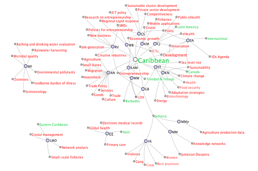
Eigenfactor has, in my opinion, one of the simplest and most sophisticated network mapping tools. Its really built for demoing their multi-level clustering algorithm, but if you upload a .net file and don't run the clustering, it still works pretty well. The layout algorithm wasn't exactly the best, it took a bit of manual tweaking like most of the programs. Major points for readability and a subtle and effective default color scheme. But if you don't like it, tough, 'cause I couldn't figure out a way to customize the colors at all. This also meant I couldn't make the country and people nodes different colors. They don't seem to have a way to actually embed the flash applet, 'tho you can save it and export the image as a pdf. I'm not quite sure how it is coming up with the edge widths, since they should be all the same unless I botched the .net export. Maybe it is weighting them using the ranking system it uses for the clustering?
Eigenfactor requires an input file in Pajek's .net file format. (See below) The .net format requires that nodes be defined first, and given id numbers which are then used later in the edge definitions. This can be a real pain if you are making the files by hand.
*Vertices 89

1 ST

2 HL

3 "Climate change"

4 "Adaptation strategies"

5 Caribbean

6 Gang

...

*Edges

1 3

1 4

1 5

2 6

...
There are some Windows tools to help with this, but I ended up writing a hack for the SoNG tool (described below) to export the .net file for the keyword graph
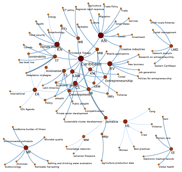
Pajek is a great, free, full-featured network analysis tool which includes some network visualization functions. I was able to export the resulting layout as an SVG image, and it also generated HTML and javascript to make it possible to switch on and off the various categories of nodes. Unfortunately, the SVG won't display at all in IE 7 and 8. I had to fine-tune the node positions by hand, create and edit a Partition to do the node colors, and change some of the SVG export options for colors and sizing. Pajek is windows-based but I was able to run it on Ubuntu linux by installing the wine package.
I'm not sure it is fair to include SoNIA related stuff in the comparison. Since I'm the developer, I don't have to deal with the learning curve. But what the heck.
This network image was done using SoNG to create a .son formated file for SoNIA (this feature isn't released yet). SoNIA is mostly built for doing network animations, but I applied the MDSJ network layout to a single frame, and tweaked the node positions, sizes and colors by hand. The inspect function for editing node properties is a bit buggy, it kept selecting the wrong nodes. Once I had a good layout, I exported the image and xml coords and used the JavaScript network display instructions to embed it on the page. If you click on a keyword, it will (usually) take you the appropriate Wikipedia page!
Protovis seems like a very elegant tool for constructing visualizations. But every JavaScript based force-directed layout example I've seen uses a small network because they are usually too slow. At first this example completely choked the browser, but I figured out that I could set the max number of iterations to 100. This stops the layout from running forever which also pushes the small components out of view. It nicely displays labels on mouseovers, and lets you drag the nodes around ('tho I'm not sure that is a good thing), and zoom with the mousewheel. It is great that it uses raw SVG, but that means it won't work in IE 7 or 8.
To build it, I copied code from the protovis network example. The example reads in the network data as a JavaScript array, so I had to reformat based on the .net file, but had to subtract 1 from all the edge records using a spreadsheet to change Pajek to javascript's id numbers.