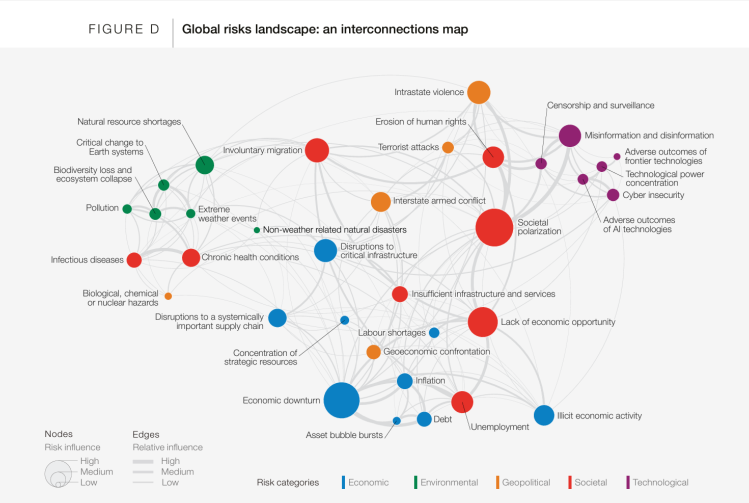
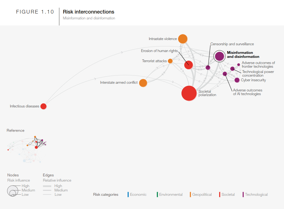
A colleague shared this neat network graphic depicting the interconnections among different kinds of risks (from the perspective of the World Economic Forum) The original document https://www3.weforum.org/docs/WEF_The_Global_Risks_Report_2024.pdf presents some details about how/who they surveyed to get numbers on relative magnitude of risks. But I couldn’t find any details about where the relationship data about how strongly the risks are coupled together comes from. Even if someone just made it up from the seat of their pants I think it is cool to illustrate that there are a lot of moving parts.
The report also need a nice narrative technique of using “hilited” excerpts of the graphic to illustrate each of the subtopic clusters in the report.
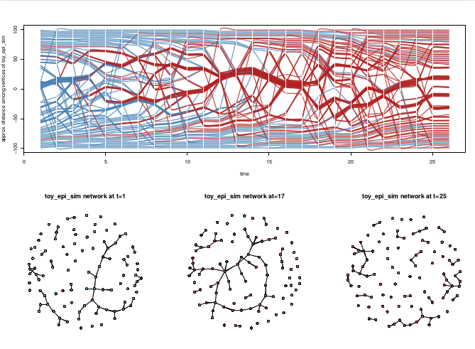
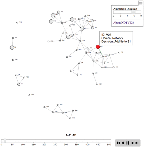
The model is an Agent Based Model that estimates a plausible transition sequence as a series of ‘microsteps’ between the two observed timesteps at the beginning and end.
The node with an opportunity to make a decision is highlighted in red, and clicking it provides information about what choice they make. Node size is proportional to smoking level. Newly forming ties momentarily flash as green, dissolving ties as red. Pressing play allows the visualization to present the entire sequence of microsteps.
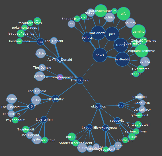
Saw this Reddit Visualizer, a interactive network map of recent cross-commenting relationships between forums.
…wider lines represent stronger connections and connections are determined by shared Redditor activity. Specifically, for each subreddit we gathered the hottest fifty posts at the time data was gathered, and checked the last 100 comments of each redditor who made those posts. Each post made in another subreddit by that redditor counted as a single point towards that connection.
The Reddit Viz team has a detailed blog post on how they built the tool.
I’m not familiar enough with Reddit culture to really asses if the network maps give a good depiction of the community structure. There certainly are some oddities, like in the example above, why are there 6 different nodes for ‘The_Donald’ subredit? Sounds like that may be intentional:
As a group we also had to decide the fate of nodes that are already present on the graph and whether or not they should be represented more than once. Again, we ultimately decided to exclude subreddits over 11,000,000 and decided to show them as grey-blue nodes to give a more complete picture of subreddit connections
The viz part was built with D3. As always, I’m wondering why we need to watch the physics algorithm in real time do a mediocre job of network layout? :-)
Graph database seem to have really matured in the last year or so, and even appeared in some very high-profile current events (i.e Panama Papers https://panamapapers.icij.org/). I'm curious to see how well Neo4J supports dynamic network data.
First, a confession: I never read Lord of the Flies. I remember thinking as a kid that it sounded scary and grim, and have yet to get around to reading it as an adult. But now I don’t have to because, thanks to Jimi Adams, I can watch a network animation of the the evolving social structure in the novel :-)
Jimi used the book in an undergrad SNA course as a way to illustrate network concepts and metrics, reporting the experience in a paper Using Lord of the Flies to Teach Social Networks. In the process he coded up all the conversations between characters in the novel (directed blue ties) — as well as their co-appearances in the same locations (undirected gray ties) — as a longitudinal network. The 473 time slices were then rendered as a video using the ndtv R package. The paper gives links to time points in the movie where the network structures can be used as examples of the concepts he discusses.
Jimi made the data available for download as a single R networkDynamic object at http://goo.gl/YWMSXQ. Encoded in the object are the durations accounting for node (dis-)appearances, durations for speaking and co-presence ties, as well as dynamic node attributes to indicate possession and transfer of the conch (the boys’ ceremonial ‘talking stick’, shown in green), and deaths. From correspondence, I’ve learned that the few red ties indicate violent conflict.
I was planning to post here an alternate temporal visualization using just one of the tie types, but realized that I’ll need to look at this in more detail in a future post. I had been thinking of this network as multiplex (with the potential for more than one edge active between a pair of vertices) but in fact tie types are coded as a dynamic ‘weight’ attribute with with discrete values for each type. This works fine for the movie but it means that tie types are mutually exclusive. Although pair of characters can’t be coded as simultaneously co-present and talking, as a work around we could probably infer the former from the latter since conversations are face to face. However the main issues is that, off the top of my head, I don’t have a method for extracting one dynamic network from another including edges as active only when an attribute is active with a certain value. Stay tuned ..
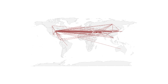
A conversation on the SOCNET mailing list made me think that it might be worth writing up a quick illustration of how to do this in R with the network library. There are a 3 steps to a really basic geographic network plot:
Get relational data with appropriate lat and long coordinates for vertices (the hard step!)
Tell one of the R mapping libraries to plot a map
Tell the network library to plot the network with the lat & long coordinates, without first erasing the map
Olaf Rank posted on the Socnet listserv yesterday about rendering 3d views of networks as movies. I created a quick rmarkdown document with both an rgl animation and a movie. To make it one step more meta, I’ve also embedded the document here on the blog post :-) If you scroll down, you can find the rgl view of the network and drag it to spin.
The movie that it renders out does not appear in the rmarkdown page, but I’ve added it here … if you happen to have the right video codecs installed. These days it seems like browser support for OpenGL may be better than rendering video! :-)
If you find this format useful, please let me know and maybe I’ll do videos for the full tutorial with more technical explanations. Its definitely a good challenge to talk about things to imaginary people :-)
Workshop
I’m going to be giving an (obviously much longer) workshop on the ndtv, networkDynamic and tsna packages at the 2016 INSNA ‘Sunbelt’ social networks conference in Newport Beach (Los Angeles) California
Managing Dynamic Network Data in statnet:
Animations, Data Structures and Temporal SNA
Session Time: Tuesday April 5th, 3:00pm-6:00pm Workshop Program