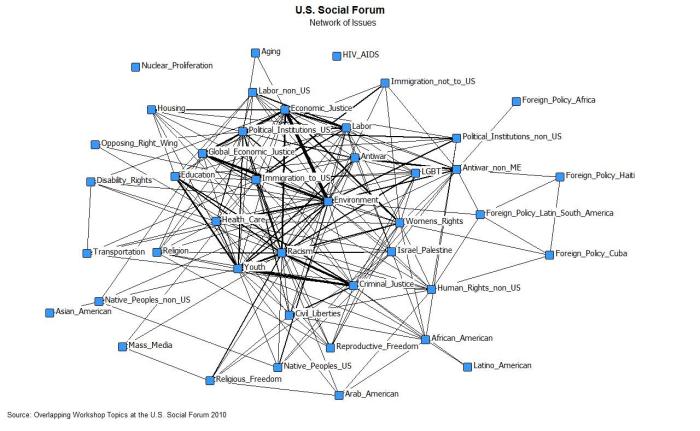
The Journal of Social Structure did a special online Visualization Symposium with peer-reviewed network visualizations. A good format, a great idea, and some nice viz examples. Hopefully next time there will be more submissions.
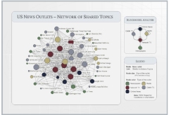
 I thought that this map of overlapping topics between media outlets was a cool idea. The resulting network seems like a fairly undifferentiated core-periphery structure, which seems typical of a lot of topic-maps-as-networks I’ve seen. Does this reflect a property of media networks, or is this what topic maps look like? Maybe a threshold filter on the edges to then out weak (or strong) ties would reveal more subtle structure? I thought the blockmodel reduction of the network was a helpful summary. The model does seem to be backed by some substantial statistical work and
… “Results of the estimation indicate that both production volume and common ownership affect the topic overlap of news outlets.”…
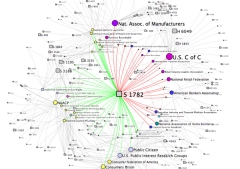
 My submission was cleaned-up interactive version of the bill-endorsement network from MapLight data with click-through to bill summaries. The layout was produced using SoNIA (now with variable node label sizes!) and the MDSJ library.

