Category Archives: time-based network data

ndtv Demo Video & Workshop

Video Demo

I’m experimenting with using a screencast as a way to give tutorials and publicize new features we release as part of the statnet packages. As my first attempt, here is a quick YouTube intro / demo to some of the key features in the ndtv (Network Dynamic Temporal Visualization) package

If you find this format useful, please let me know and maybe I’ll do videos for the full tutorial with more technical explanations. Its definitely a good challenge to talk about things to imaginary people :-)

Workshop

I’m going to be giving an (obviously much longer) workshop on the ndtv, networkDynamic and tsna packages at the 2016 INSNA ‘Sunbelt’ social networks conference in Newport Beach (Los Angeles) California

Managing Dynamic Network Data in statnet:
Animations, Data Structures and Temporal SNA

Session Time: Tuesday April 5th, 3:00pm-6:00pm
Workshop Program

tsna : Tools for Temporal Social Network Analysis

We finally got the alpha release of the new tsna package up on CRAN! The goal is for the package to be a repository of algorithms and techniques for doing Social Network Analysis on longitudinal networks stored as networkDynamic objects. It includes:

The package vignette has lots more details.

As a quick example, the code below extracts a forward temporal path (think “what is the earliest journey a message could take from vertex 10 to each vertex in the network while respecting edge timing”) and plots it as a transmission tree, including the transmission time for each edge:


# load the libraries
library(tsna)
library(ndtv)
# load a dynamic network example
data("moodyContactSim")
# compute the forward temporal path from vertex 10 at time 0
v10path< -tPath(moodyContactSim,10)
# plotting trees still a little complicated, 
# but with Graphviz and ndtv we can do it
plot(v10path,
    coord=network.layout.animate.Graphviz(as.network(v10path),
          layout.par = list(gv.engine='dot')),
    edge.label.col='blue',
    main='earliest fwd path transmission times from vertex 10')

v10_fwd_path

Create in-browser interactive network animations from R with ndtv 0.6.1!

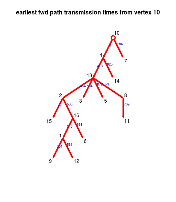
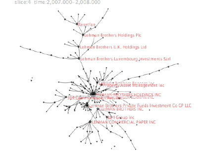
We are releasing an update to the R ndtv package for doing temporal visualizations of dynamic networks. The biggest new feature in this release is the ability to render networks as interactive SVG animations in a web browser with a single command via the ndtv-d3 javascript library (authored by Greg Michalec and myself for statnet) .

By default you can

  • play forwards and backwards, jump to any point in the timeline
  • zoom (mousewheel or pinch)
  • pan (drag)
  • display tooltips (click on a vertex or edge)
  • highlight connections (double-click a vertex)
  • change the playback speed (menu in upper right)

The example above can be produced in your local web browser with the R code below:

library(ndtv)
data(short.stergm.sim)
render.d3movie(short.stergm.sim)

Much of it is customizable. If you want to get under the hood, I’ve created a short vignette for ndtv-d3 with additional details on how to configure the the network plot (it generally follows the conventions of plot.network and render.animation) and how to include the results rmarkdown documents or export for embedding in a blog post like this one.

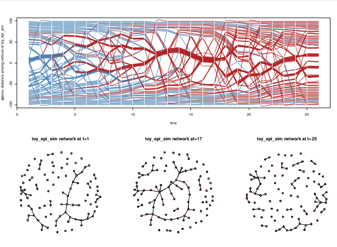
There are a number of updates and improvements elsewhere in the package. For example, the proximity.timeline function can now color by vertex attributes.

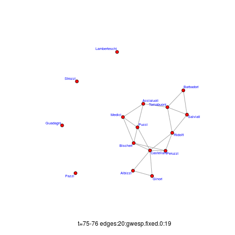
This image shows a trivial simulated epidemic process on a dynamic network produced by EpiModel. Horizontal splines correspond to the vertices of the network, with red color indicating infection status. The vertical positions are adjust to place closely-connected vertices in proximity, so you can see how the components group and break apart over time. The network snapshots below the timeline illustrate three time points for comparison. See the package vignette for example code.
proxTimeineWithInf

If you will be at the 2015 INSNA conference, we will be doing a workshop session on Tuesday June 23 with in-depth tutorials of the package.

Multiple modes of flying flows

While trawling for interesting dynamic network datasets, I bumped into one about U.S. airport passenger traffic aggregated by Zachary Neal.. I lifted this image from his slides (p.9):
airportTransitNets

These data contain annual U.S. air traffic flow networks from 1993 to 2011. They were constructed from Bureau of Transportation Statistics’ Origin and Destination Surveys using the AIRNET program

What I thought was cool is that he constructs the network in two ways: one is the passenger flow between specific airports, the other is total passenger movement between metropolitan areas (if I’m reading his data correctly). He claims the first approach yields a hub-spoke network driven by airline hubs, while the second highlights travel between dense population areas. Both are derived from the same data. I think it shows how important it is to think carefully about how to construct networks that correspond well to the phenomena being studied. Are we interested in relative traffic between cities, or in the the actual flow of people (via roads, airports) between the cities? In hindsight, its obvious that these are very different networks (the first one for example should be nearly fully connected, right?).

I’m assuming that there is some thresholding going on in these images, ’cause the dataset he provides seems to have lots more edges in it.

Relationship Timelines

I finally had a chance to pull together a bunch of interesting timeline examples–mostly about the U.S. Congress. Although several of these are about networks, the primary features being visualized are changes in group structure and membership over time. Should these be called “alluvial diagrams”, “stream graphs” “Sankey charts”, “phase diagrams”, “cluster timelines”?

James Moody and Peter Mucha’s Portriat of Political Party Polarization (in the new Network Science journal) plots the network modularity score of structurally-equivalent voting clusters in the Senate co-voting network as they change over time. The lines show the movement of Senators between clusters over time.
moodyCongressPolarization

The figure maps this dynamic coalition network, one two-year Congress at a time. Nodes indicate structurally equivalent positions, scaled by number of Senators and shaded by their voter agreement level. In each period there are two “party loyalist” positions, anchored on the y-axis proportional to the modularity score. The y-position of other nodes—usually individuals—is based on the balance of their votes relative to these anchors. Positions are linked over time by identity arcs connecting each person to themselves over time, labeled to trace individual careers (the widths of arcs between aggregate positions indicate the number of people moving between them over time).

Continue reading Relationship Timelines

ndtv animation “live” at London Science Musuem

Dr. Michael White wrote to let me know about an exhibit / performance at a science museum that used a network animation produced with the ndtv package.

… we used QR codes and tablets to monitor the spread of an infectious disease throughout people attending the museum, and perform dynamic network visualizations in real time.

The article is a little vague about exactly how this worked, but it sounds like the visitors were given tokens to pass to each other, a few of which were labeled “infected”, and at various points they were scanned in by staff and the data used to update the animation of the transmission network? The animation is included in the article. Cool to see the software used in real life!

Talk at TransparencyCamp 2010

The Sunlight Foundation recently brought all of its grantees together so that each organization could learn more about what the others were working on. Since they funded the work on the CorpWatch API, I got to attend. They also invited folks to stay over the weekend and attend the TransparencyCamp, a 2-day “un-conference” in DC for folks interested in getting the government to be more open an responsive with its data.

I gave a presentation on the work we did on the CorpWatch API, and why I think it would be a good idea to develop a common standard id system for company and organization names. The talk was streamed live, and archived as well. I sound a bit jet-lagged ;-)

The slides from the talk are here (pdf).

I really enjoyed the un-conference format: participants basically shout out what they want to present or discuss and convince folks to come to their sessions. Got to finally meet face to face with the people who have been doing all the amazing work to provide the data we use in so many projects. Had some great discussions about trying to build some kind of larger project to create a common id system that various organizations could link to so that companies can be correctly matched and aggregated across datasets. Learned a lot. Was especially interested in some of the work being done internationally, seemed at time more pragmatic, less obsessed with the latest shinny new tech toys.