I finally had a chance to pull together a bunch of interesting timeline examples–mostly about the U.S. Congress. Although several of these are about networks, the primary features being visualized are changes in group structure and membership over time. Should these be called “alluvial diagrams”, “stream graphs” “Sankey charts”, “phase diagrams”, “cluster timelines”?
James Moody and Peter Mucha’s Portriat of Political Party Polarization (in the new Network Science journal) plots the network modularity score of structurally-equivalent voting clusters in the Senate co-voting network as they change over time. The lines show the movement of Senators between clusters over time.
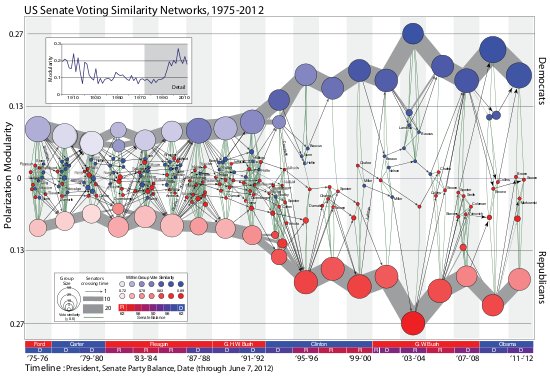
The figure maps this dynamic coalition network, one two-year Congress at a time. Nodes indicate structurally equivalent positions, scaled by number of Senators and shaded by their voter agreement level. In each period there are two “party loyalist†positions, anchored on the y-axis proportional to the modularity score. The y-position of other nodes—usually individuals—is based on the balance of their votes relative to these anchors. Positions are linked over time by identity arcs connecting each person to themselves over time, labeled to trace individual careers (the widths of arcs between aggregate positions indicate the number of people moving between them over time).
Adrien Friggieri’s interactive diagram Agreement groups in the United States Senate also uses co-voting data from GovTrack and a new self-authored clustering algorithm. I have to admit that I haven’t read the clustering paper they reference and so don’t fully understand the diagram. Why does Jesse Helms’s line bifurcate in the 106th Congress? I also have trouble finding similar clusters and movements between clusters when comparing these two diagrams which cover very similar datasets.
Khairi Reda (et. al)’s 2011 paper Visualizing the Evolution of Community Structures in Dynamic Social Networks also looks at U.S. Congress (as well as zebra social networks), but uses co-voting networks in the House of Representatives.
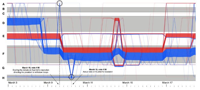
It appears that the clustering was done in the co-voting network (counting Yes, No and Not Voting as seperate types of ties, which I think is an unusual representation?) to partition the House into communities (arranged as the alternating gray and white bands) and then individual’s trajectories are plotted as the colored threads. But it sounds like each band doesn’t always represent the same community, otherwise, how would the lines move between the communities?
… the layout algorithm calculates a vertical position for each community, as well as vertical offsets for the threads of individuals within communities. The ordering of communities is based on an influence factor, which we define as the cumulative number of individuals affiliated with the community over all timesteps (individuals may appear more than once in this count). The communities are then assigned to rows. A single row can contain multiple communities as long as they do not overlap in time. We loop through all communities in decreasing order of influence and assign each community to the first available row, taking care to not overlap with existing communities.
Interestingly, they also cite the xkcd movie narrative image below as partial inspiration for their approach.
Fittingly, the last Congress example includes both chambers. The xkcd webcomic (by Randall Munroe) published a giant poster entitled: History of the United States Congress Partisan and Ideological Makeup
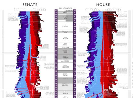
He does the off-time-axis positioning using the elegant/crude measure of number of seats held by each party. Which I guess means this isn’t technically a network digram at all, its more of series of stacked bar charts, a “stream graph”. The annotations and relatively few highlighted trajectories of individual persons make the chart very readable.
The xkcd movie narrative charts are wonderfully clear and amusing illustrations of the concept.
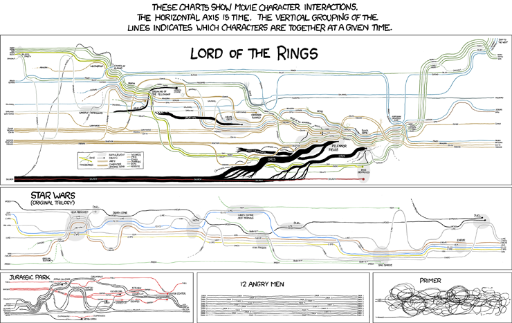
Each character traces out a line horizontally (well, usually) in time, while the vertical grouping of the lines indicates which characters are together at a given time. Reminds me of work by the artist Ward Shelly who creates artistically positioned highly detailed timeline diagram paintings like his Autobiography. Like the the narrative charts, the off-time axis positions seem well organized but at the same time fairly arbitrary, arranged for visual clarity and sometimes dramatic effect.
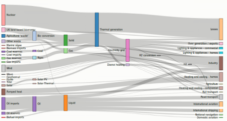
It seems like it would be quite challenging to write an algorithm capable of doing this type of layout optimization, but clearly people have done it. One of them is Mike Bostok’s d3 infoviz toolket Sankey example (he credits http://tamc.github.io/Sankey/ for original code).
His write up explains the the algorithm:
Sankey diagrams visualize the magnitude of flow between nodes in a network. This intricate diagram shows a possible scenario for UK energy production and consumption in 2050: energy supplies are on the left, and demands are on the right. Intermediate nodes group related forms of production and show how energy is converted and transmitted before it is consumed (or lost!). The thickness of each link encodes the amount of flow from source to target.
This example is built with D3’s Sankey plugin. The plugin takes as input the nodes and weighted links, computing positions via iterative relaxation. After fixing the horizontal position of each node, the algorithm starts from the sources on the left, positioning downstream nodes so as to minimize link distance. A reverse pass is then made from right-to-left, and then the entire process is repeated several times. Overlapping nodes are shifted to avoid collision.
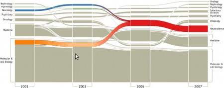
Martin Rosvall and Carl T. Bergstrom have built an Alluvial Generator Flash web app for creating these types of timeline charts based on network clustering derived from their clustering algorithm. (It does nice clustered network digrams as well.)
I’m considering trying to generate something like this in R, so I’d love to see other good examples.
Update Jan 14, 2014:
An interesting example from a dataset tracking kids’ locations during a school day:


Great post of vintage timeline maps at Chartporn: http://chartporn.org/2013/08/21/timeline-maps/
Wish I could find an image of this congress map outside of their catalog: http://www.timeplots.com/collections/catalog/products/a-visual-history-of-the-us-house