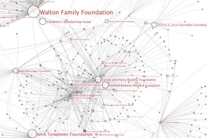
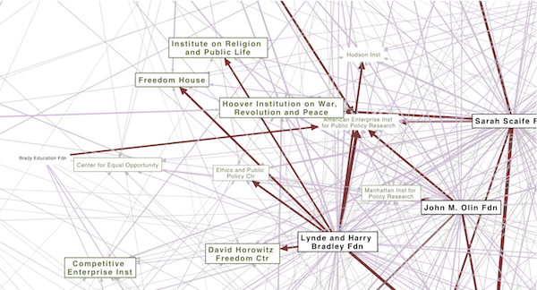
I’m interested in making political structures visible. Trying to put those half-realized connections and linkages into a tangible form–a map that we can point to. I recently located an online database of conservative funding relationships created by Media Matters Action Network. I was able to scrape the site and (with their permission) experiment with some network diagrams in pdf form to visualize the funding relationships among “angel investor” foundations and right-wing organizations.
The Map
Yup, it is visually overwhelming. There is almost too much going on to make sense out of it. And this is actually a drastically reduced and filtered view of the funding relationships, most of the organizations have many additional ties that I am not displaying. The Walton Family Foundation for example has ~2800 grants, of which I’m showing about 10. I’ve tried to use some size and color elements to help highlight large organizations and particularly strong relationships.
I did this network map as a PDF, because it seems like a simple and portable way for viewers to zoom in and move around on the network. Also, I was able to embed URLs in the diagram, so if you click on a node it will load the appropriate Media Matters web page with a brief profile, additional financial information, etc. And you can use the “find” function in your pdf viewer to locate specific groups.
- Check out the two “Koch” foundations that have been in the news recently (also, here is a view of another type of Koch funding ties).
- Some foundations make contributions to themselves (Walton Family Foundation) or other closely related foundations (the two Kochs again).
- The Heritage Foundation and the American Enterprise Institute seem to be the most central and solidly funded part of the backbone. (‘tho it may be because those are the groups the data collection started with?)
- How many of these groups have you heard of before?
- Do the groupings and linkages make sense to you? Any thoughts or suggestions?
I was kind of expecting to see different regions in the network covering specific issues. That is not immediately apparent to me here, but it could be because I don’t know the groups’ agendas well enough. Might be more interesting to look at a much larger set that also includes liberal groups and covers lots of issues, to see where the overlaps are. Would also be helpful to add some sort of issue or ideological coding to the groups. PublicEye.org has some interesting discussion of categorizations.
The Data
According to Media Matters, the Conservative Transparency Project is an effort to track who is funding the conservative movement. Like its right-wing counterpart, activistcash.com (a project of the Center for Consumer Freedom, which is unfortunately missing from the dataset), the database of funding relationships, financial profiles, and key personnel is constructed using the public documents (Form 990) that non-profits are required to file with the IRS. I think this is fairly recent project of Media Matters, completing all of the profiles is a huge undertaking, and some of the more obscure organization still need to be aggregated. Pay/semi-free services like GuideStar and the Foundation Center probably have much more complete profiles, but also much grumpier use restrictions.

Since the Conservative Transparency database has records for several thousand organizations, I needed to narrow the scope a bit to get a usable visualization. First, I only pulled down relationships that totaled more than $100,000. I then experimented with additional filtering out various organizations by the amount of money associated with them. I also tried hiding all the universities and colleges, and also only including organizations that received grants from at least two foundations. All of these views were interesting, but I wanted to focus in on a subset of “politically relevant” organizations for the visualization. Since I’m lazy (i.e. doing this for free) I’m not (yet) going to process the descriptions for keywords or try to categorize the groups by hand. So I finally settled on a kludge of only including organizations that Media Matters had a profile blurb for, assuming that they have started with the most interesting organizations.
Notes about coding details
I also used this as an opportunity to experiment with some new tools and techniques. The network graph layout was done with the GraphViz package. Although I’ve used GraphViz heavily in a number of recent projects, I recently discovered a included set of powerful tools. The gvpr command, which functions as a network-aware search-and-replace syntax, is especially amazing. Tho’ its really kind of a complete scripting language. This means that once my web-scraping or database scripts have created a file in the .dot format, it is possible to string together a bunch of GraphViz unix commands to do the filtering, coloring, and many other sophisticated network processing operations very efficiently. However, like many command-line tools, the awesome power and compactness also means that the tools have a learning curve that feels like running into the side of a skyscraper. Since I found very few examples out on the web, I’m including the commands I used here (also so I can find them again in the future):
gvpr -c 'N[role=="funder"]{fontcolor="black",color="black"}' MMAN_dump5.dot| gvpr -i 'N[blurb==1 | role=="funder"]' | gvpr -c 'N[cash< =200000]{fontsize=12,color="white"}' | gvpr -c 'N[cash>100000]{fontsize=15}'| gvpr -c 'N[cash>1000000]{fontsize=20,penwidth=2,fontname="Helvetica-Bold"}'| gvpr -c 'E[cash > 500000]{color="thistle",len=12}' | gvpr -c 'E[cash > 5000000]{color="indianred4",arrowsize=2,len=8}' | neato -Teps -o tester.eps
This is a series of commands, strung together with unix pipes to do the following:
- Load in the .dot file of my network, find all the nodes with a role attribute of “funder”, and color them black
- taking the previous network as input, output a new network that only includes nodes that have an attribute blurb=1, or a role of “funder”
- Set a smaller font size and background color for nodes with less than $2,000,000 in cash
- Set a larger font size on nodes with more than $100,000 in cash
- Set a larger bold fond and a thicker border on nodes with more than $1,000,000 in cash.
- Color all the edges with more than $500,000 in cash, and make them a little shorter.
- Then color all the edges with more than $5,000,000 in cash a darker color, give ’em a bigger arrow, and make ’em even shorter.
- Finally, feed the resulting network into the GraphViz neato command to calculate the layout positions, and produce a .eps postscript file.
Although GraphViz can output a PDF file directly (-Tpdf), the pdf it produces won’t support the click-able urls. To get that to work, I exported as .eps and than ran
epstopdf tester.eps --outfile tester.pdf
to do the pdf conversion. (Don’t use ps2pdf, it wont respect the image pagination).
A few other useful commands:
gvpr -i 'N[degree>1]' myFile.dot
Only keep nodes in the network that have more than 1 tie.
gvpr -c 'N[match(label,"University") >= 0]{fontcolor="darkorange4"}' myFile.dot
If a node’s label includes the string “University”, color it orange.


Fantastic work! I’ve been fascinated by this kind of thing for years but haven’t found much until now! I Just found your site after reading an article in the Boston Globe on Philip Howard’s soft drink graph and am eager to absorb some of your other work.
I’m now curious if 3-Dimensional interactive maps could help ease the data overload problem you mention.