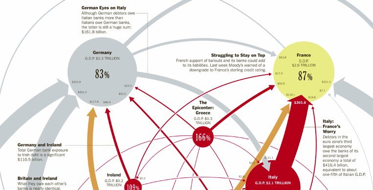
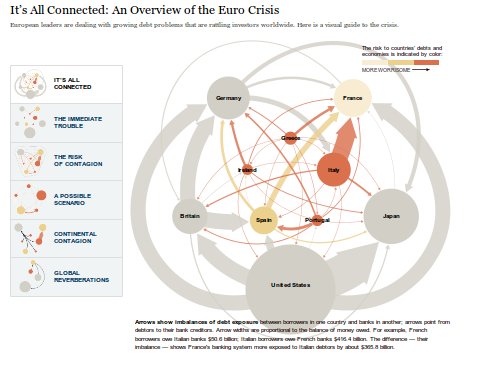
The folks at the New York Times continue to produce awesome data visualisations for their stories. Recently they’ve been splitting production to produce both print (above) and online interactive versions (below) of their figures. This is great, because it makes it possible to design for the strengths and weaknesses of each medium. The interactive version of the the Overview of the Euro Debt Crises viz is also really nice because the the column on the left allows selective hi-lighting of different elments of the network corresponding to various parts of the narrative. And its all in SVG! (via Ronald Rice)


