
Just found out that Oil Change’s follow the oilmoney tool got a little blurb in an Italian fashion/women’s magazine:
“D” la Repubblica delle Donne, March 8, page 52
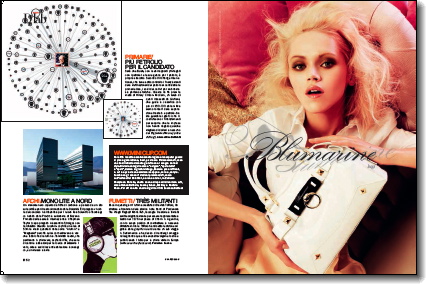
Yup, that’s us in the upper left — if you can draw your eyes away from that purse. The juxtaposition brings up an interesting point. One of our goals was to try to put campaign funding data into more visually interesting and accessible form, try to catch people’s eye and interest so they will click in and learn something. Yet despite many months of work, what we produced looks clunky and amateurish next to a high-production fashion ad.
Perhaps this is OK — it would be pretty inappropriate to be using images of sexy women to sell campaign finance reform. But it does make me wonder if infographics really have any potential to compete for people’s media attention. Maybe we just need better designers.
In a more content-related direction, the site now has VoteTracker feature for showing how Congress-people voted on specific oil- and climate-related bills.
![]()
Figuring out how to get that much data into a semi-usable form was a major headache. Would love to see any suggestions people have found for better ways to do this. Below is one option we considered, but thought would be too complicated to implement and explain to viewers. Idea is to demonstrate the correlations between receiving money from and voting in favor of the petroleum industry.

A regular correlation plot seems to hard to interpret for those outside of academia. Ditto histograms. So this plot is a bar-graph, one bar for each Representative, showing how much money they received. But color-coded so that the red channel is % voted for oil, and green is % voted for environment / public interest? Maybe with mouseovers and zoom for each column so you can still get the data so you can still get profile data and pic for each Rep? I think it gives a good overview, but it would be really hard to see and click on the ‘oil-poor’ Senators on the left side of the plot. Better examples anyone?
>Yet despite many months of work, what we produced looks clunky and amateurish next to a high-production fashion ad.
On the other hand, how hot looking does your graphic have to be to get into a fashion magazine at all? Pretty hot
>I think it gives a good overview, but it would be really hard to see and click on the ‘oil-poor’ Senators on the left side of the plot. Better examples anyone?
Put a fixed-thickness horizontal bar below the bar graph continuing each color bar from above (with a horizontal white space separating the two). So the upper object gives the height of each bar, and the lower object shows how the green concentrates to the left and red to the right, without making the green parts disappear because they’re so short.