ABSTRACT: Abstract: If graph drawing is to become a methodological tool instead of an illustrative art, many concerns need to be overcome. We discuss the problems of social network visualization, and particularly, problems of dynamic network visualization. We consider issues that arise from the aggregation of continuous-time relational data (“streaming” interactions) into a series of networks. We describe our experience developing SoNIA (Social Network Image Animator, http://sonia.stanford.edu) as a prototype platform for testing and comparing layouts and techniques, and as a tool for browsing attribute-rich network data and for animating network dynamics over time. We also discuss strengths and weakness of existing layout algorithms and suggest ways to adapt them to sequential layout tasks. As such, we propose a framework for visualizing social networks and their dynamics, and we present a tool that enables debate and reflection on the quality of visualizations used in empirical research.
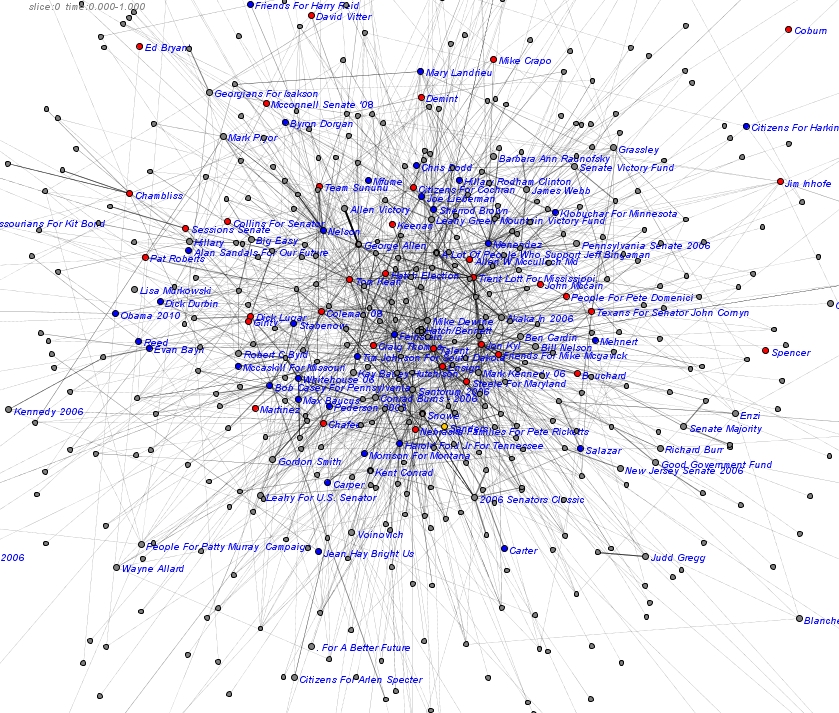
It is still very rough, but I’ve been having a very interesting time looking at contributions among PACs in FEC Data. This image shows transactions to Senate candidate’s central committes that were reported in May of 2006. Colors by party, grey is unkown / unspecified. Labels are on candidate’s committes, but some are violently truncated. Names of PACs have been removed to protect the guilty (actually because they are too long and make the graph cluttered)
They layouts are not converging very well, so the structure is not that accurate. This is also only showing one month’s data, so not very representative. But need much more specific queries and good aggregation rules to deal with longer time periods. Easy to imagine making it interactive, zoomable, animating the time data, adding to SNA metrics, etc. A long ways to go to build software to do this, but I’m excited to have something to show!
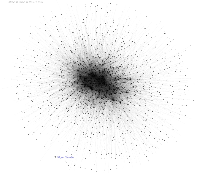
I started poking around in omidyar.net a few days ago, curious if it can be a resource for locating activist techs and funding. As I’m not really a member of any of the “social networking” sites, I don’t really have a sense of the social protocol. It is kind of like stepping blind into a cocktail party. A few people immediatly contacted me, but I didn’t know who they were other than by reading their profiles. So I got curious about the structure of communication of the site. After a day or so of coding with a little help from carnivore, htmlparser and sonia, I’ve got a few pictures of the network of positive feedback on comments. (people have the ability to give points to eachother’s posts in the fourms, kinda like slashdot)
Nice idea, building collaborative software for tagging and tracking commercial products. “Network of Integrated Consumer Knowledge” Eugene based software co. http://www.grasscommons.org/
Grass Commons, a 501(c)3 public interest charity, is building pipelines between those who can generate information about products and companies and those who can use that information to build a more sustainable economy and a better world.
Grasscommons seems to have a collaborative relationship with Hooze,
Hooze.org is about collaborating to gather useful, reliable info about the products and companies that are shaping our world.
Hooze is the world’s first public wagging site. Wagging combines wiki and tagging in unique ways so that communities of users can organically develop ways of organizing and presenting information. The combo cards at the bottom of this page are an example of how wagging differs from other tools.
And also seems to be building tools like data integration engines. Not only that, but also researching for open-source licensing for structured data. Something that would be very important for an organization that would like to curate data and provide it to the public…
Krugal seems to be a nice project for searching code snips and algorithm implementations. Currently mostly sourceforge stuff, I found some very familiar code ;-) also alternate implementations I’d like to look at in detail
Krugle is designed to locate code. Krugle supports code search by crawling, parsing and indexing code found in all open source repositories, as well as code that exists in archives, mailing lists, blogs, and web pages. (http://corp.krugle.com/product/index.html)
Definitly still in beta, but seems to work pretty well.
PajekConverter is a basic utility (written in Java) for converting tab-delineated text files into a format readable by the network analysis and visualization software Pajek. Pajek is Windows-based freeware, written by Vladimir Batagelj and Andrej Mrvar, University of Ljubljana, Slovenia Downloadable from: vlado.fmf.uni-lj.si/pub/networks/pajek/
PajekConverter was written by skye for John Padgett, University of Chicago.
Bugs and Questions to: skyebend@santafe.edu
Dr. Martina Morris (PI) & Dr. Mark Handcock at the Center for Studies in Demography and Ecology of University of Washington are funding a SoNIA-related project contract to integrate dynamic network visualization techniques with the R statnet package developed by Morris, Handcock, et al at the CSDE. The funds come from the NIH grants supporting the Network Modeling Project at the University of Washington (grants R01 HD41877 and R01 DA12831)
The focus is on adapting and developing visualization techniques for dynamic network data. The specific emphasis will be on techniques relevant for understanding:
a) infectious disease transmission (change in state of elements due to a network diffusion process) and
b) the stationary dynamics (model-based addition and removal of nodes/edges) of longitudinal network data and simulation output.
The goal is to develop robust, rigorous and repeatable procedures for visually interpreting time-based network data. We will achieve this by linking existing software components and improving existing techniques to generate animations and export movies from R or other statistical packages into standard formats suitable for use in presentations or websites.
I worked for a year or so as a consultant at ATA SpA in Lucca Italy. ATA (now defunct) was a academic spinoff/tech startup that works with various kinds of networks. Especially networks relevant to the bio-pharma industry, such as patent citations, term co-occurrence in medical journal abstracts, co-authorship, etc. Overall the goal was to come up with systematic techniques for creating overviews research domains (or other proprietary DBs) that allow the user to locate interesting regions and then inspect the underlying data. This is an area many researchers are focusing on, but I think part of what was innovative about ATA’s Dynet project was its focus on networks that are evolving in time.
Dan McFarland is professor in Sociology/Education at Stanford. He has collected lots of “streaming” interaction data of students in classrooms. The data can be used to generate networks with very high temporal resolution (< 1 min). I worked on data processing scripts in java, analysis in R, and on developing visualizations. We also began the SoNIA project partially as a tool for working with this data. Some of the work ended up in publications, available from Dan’s website. Movies showing the networks evolving in time (and more details about the data) are on the SoNIA project page.
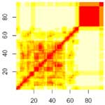
The figure here is a distance matrix of conversation networks extracted as 2.5 minute sliding windows for one class period. Each row (or column) of the matrix shows the comparison of a single slice network to all of the others. White indicates large differences between networks, red means low. Time moves from the lower left to the upper right, so the red diagonal shows that each slice is similar to itself. This picture seems to show a period of varying structure for the first 2/3 of the class, and a final segment that is very different.

 OK, so we look kind of silly in the white pajamas, but our contingent organizer looks freeking fierce!
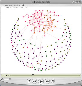

 The figure here is a distance matrix of conversation networks extracted as 2.5 minute sliding windows for one class period. Each row (or column) of the matrix shows the comparison of a single slice network to all of the others. White indicates large differences between networks, red means low. Time moves from the lower left to the upper right, so the red diagonal shows that each slice is similar to itself. This picture seems to show a period of varying structure for the first 2/3 of the class, and a final segment that is very different.