

I’m interested in making political structures visible. Trying to put those half-realized connections and linkages into a tangible form–a map that we can point to. I recently located an online database of conservative funding relationships created by Media Matters Action Network. I was able to scrape the site and (with their permission) experiment with some network diagrams in pdf form to visualize the funding relationships among “angel investor” foundations and right-wing organizations.
Continue reading Angels of the Right v1.0
Category Archives: network viz
Many Brands of Bubbly Bottles and Cans
… but only a few owning companies. Another great study and diagram of brand ownership relations by Philip Howard.

…To visualize the extent of pseudovariety in this industry we developed a cluster diagram to represent the number of soft drink brands and varieties found in the refrigerator cases of 94 Michigan retailers, along with their ownership connections.
Although, according to the Soda vs. Pop map, since the study was in Michigan, maybe it should be labeled “Pop” not “soft drinks”? ;-)
JoSS Visualization Symposium 2010
The Journal of Social Structure did a special online Visualization Symposium with peer-reviewed network visualizations. A good format, a great idea, and some nice viz examples. Hopefully next time there will be more submissions.
 I thought that this map of overlapping topics between media outlets was a cool idea. The resulting network seems like a fairly undifferentiated core-periphery structure, which seems typical of a lot of topic-maps-as-networks I’ve seen. Does this reflect a property of media networks, or is this what topic maps look like? Maybe a threshold filter on the edges to then out weak (or strong) ties would reveal more subtle structure? I thought the blockmodel reduction of the network was a helpful summary. The model does seem to be backed by some substantial statistical work and
… “Results of the estimation indicate that both production volume and common ownership affect the topic overlap of news outlets.”…
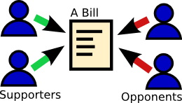
 My submission was cleaned-up interactive version of the bill-endorsement network from MapLight data with click-through to bill summaries. The layout was produced using SoNIA (now with variable node label sizes!) and the MDSJ library.
US Social Forum Topic Network

Michael Heaney and Fabio Rojas just released another great network map in a blog post. This one shows the co-mentions of topics (as coded by the researchers) appearing in the descriptions of panel discussions at the recently concluded 2010 US Social Forum in Detroit. The map functions as a coarse-grained representation of interconnectedness of the various topics, and presumably how important and relatively central they are to the activists and organizers participating in the forum.
The Contractor Food Web: Visualizing the flow of Recovery Act dollars to defense contractors

Found a well-structured dataset on Recovery Act contracts at fedspending.org. Created a network map for the Awards funded by Department of Defense (except military departments) category. Also serves as a crude user interface to the data. Clicking on contractor nodes links to full record with information about the contract.
Would love to build something like this for the whole dataset, or for the TARP funds.
Fedspending.org already does some flash-based geographic maps to show which states the money is (initially) ending up in.
(click for interactive version)

UPDATE Feb 11, 2010
When working with the this data, I was very surprised to see a name I recognized jump off the screen. Nehalem River Dredging is small 2-6 person operation with a single boat based in my home town. Could they really be receiving a $47,150,000 contract with the Army Corps? Almost 50 million dollars!? That probably greater than the entire yearly economic output of the town. Since this data is known to have some highly-politicized problems (like the flap about the non-existent congressional districts) it seems like there may be some kind of error. My father called up the Port wheer the dredging is being done to investigate. Sure enough, they said there is a two decimal place error in the reported contract amount. It was actually $470,150. So I guess the message is take this data (which is self reported by recipients as I understand it) with a grain of salt, there is plenty of room for two-orders-magnitude errors to sneak in.
Feed & Seed
Phil Howard has built another corporate consolidation dataset, this one on ownership networks of seed distributors.

[click for pdf version of network]
Health care lobbying networks
Valdis Krebs recently posted a nice viz of the health care lobbying network surrounding Max Baucus using data from LittleSis.org and the Center for Responsive Politics.

Gives an interesting perspective on who might stand to benefit from the current proposals: probably not those of us who are uninsured. Starting to seem pretty unlikely that we will get a reasonable single-payer plan :-(
Concurrency and Reachability movie

View as: QuickTime | YouTube | other formats.
A movie premier! Yup, this week we are releasing a scare-thriller by the name of Concurrency and Reachability: transmission in a dynamic network. Don’t let the title fool you, the topic is a bit sexier than it sounds, as the underlying network model used to simulate disease transmission was derived from data on real-world sex contact networks.
Continue reading Concurrency and Reachability movie
Oilmoney Redux
The main conference on Social Network Analysis was is in San Diego this year, so I decided to make a trip down. Was nice to step away from the screen and see old and new faces from the far-flung research community. Amusingly, the conference landed in the middle of spring break celebrations, so there were bearded academics wandering geekily around in crowds of drunken sunburnt 20-something revelers.
 I gave a presentation at the very tail end of the conference to demonstrate some features of the oilmoney website—including a presidential contribution movie, and bit of analysis on the data. Much of this will be familiar to anyone who has read these earlier posts, but the stat stuff is new.
Warning: the rest of this post is pretty geeky, read at your own risk ;-)
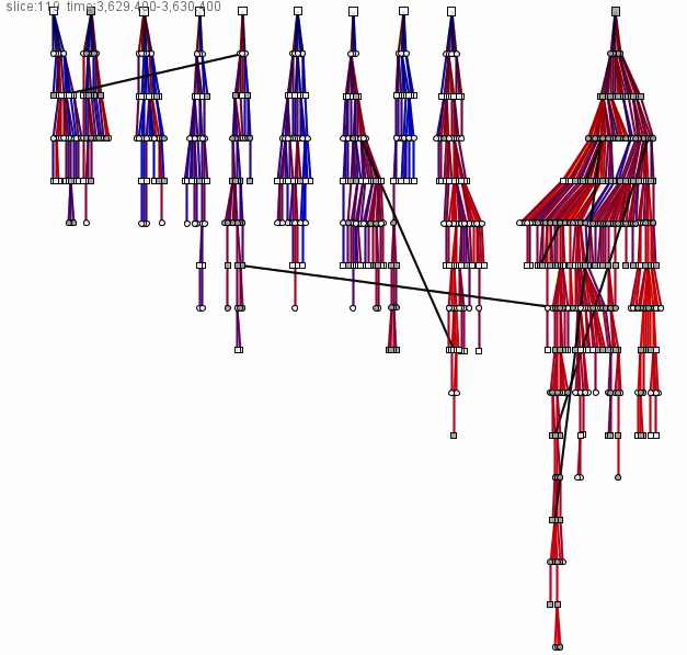
Digging into MAPLight.org’s Bill Endorsement Data
 Dan Newman, director of the money in politics watchdog/transparency site MAPLight.org kindly shared some of their bill endorsement data for me to explore. In addition to providing an elegant interface for accessing California and U.S. Federal campaign contribution data and voting records, MAPLight’s interns do extensive research to determine various organizations positions on bills that are being voted on in Congress. These endorsement and opposition relationships can be thought of as ties linking the organizations to the various bills they take a position on. The ties can then be assembled to form—yup, you guessed it—networks of bills and their supporters. My hope is that giving the bill data a relational treatment might reveal some of the coalitions and give additional context for each organization’s position.
Continue reading Digging into MAPLight.org’s Bill Endorsement Data