Category Archives: pubs & papers

new ndtv release: 0.7

..and continuing in the thread of long-overdue R package updates, we’ve got a new ndtv version out as well.

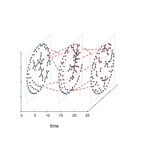
Peek into the time prism

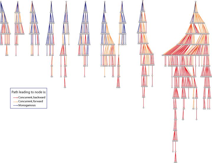
The package release adds some “whiteboard candy”: 2.5D orthogonal projection of networks in time along a z axis. For lack of a better name, I’ve dubbed it a timePrism (let me know if you find a pre- existing better name). Think of viewing all of the slices from a filmstrip from an angle. Probably hard to follow for large networks (or lots of time slices) but nice for illustrating concepts in temporal networks when you want to convey time and structure and can accept some loss of detail. Especially with the ability to include splines connecting specific vertices for highlighting trajectories.


library(ndtv)
data(toy_epi_sim)  
timePrism(toy_epi_sim,
           orientation=c('z','y','x'), # swap axes
           angle=40,
           spline.v=c(7, 29, 36, 70, 82, 96),  # hilite the infected 
           spline.col='red',
           spline.lwd=2,
           box=FALSE,
           planes=TRUE,  # draw a semi-transparent 'plane' under each net
           vertex.col='ndtvcol'  # use pre-created infection color scheme)

timePrism
Continue reading new ndtv release: 0.7

tsna : Tools for Temporal Social Network Analysis

We finally got the alpha release of the new tsna package up on CRAN! The goal is for the package to be a repository of algorithms and techniques for doing Social Network Analysis on longitudinal networks stored as networkDynamic objects. It includes:

The package vignette has lots more details.

As a quick example, the code below extracts a forward temporal path (think “what is the earliest journey a message could take from vertex 10 to each vertex in the network while respecting edge timing”) and plots it as a transmission tree, including the transmission time for each edge:


# load the libraries
library(tsna)
library(ndtv)
# load a dynamic network example
data("moodyContactSim")
# compute the forward temporal path from vertex 10 at time 0
v10path< -tPath(moodyContactSim,10)
# plotting trees still a little complicated, 
# but with Graphviz and ndtv we can do it
plot(v10path,
    coord=network.layout.animate.Graphviz(as.network(v10path),
          layout.par = list(gv.engine='dot')),
    edge.label.col='blue',
    main='earliest fwd path transmission times from vertex 10')

v10_fwd_path

Angels of the Right – version 2.0

I’ve been working for the past several months to build AngelsOfTheRight.net a new interactive version of the conservative philanthropy network data from the Media Matters Conservative Transparency Project and other sources. The idea is to have an atlas where you can dive in, explore, and see which organisations have similar patterns of funding relationships. As always, my hope is to make some of these invisible economic and power relationships a bit more tangible.
Continue reading Angels of the Right – version 2.0

JoSS Visualization Symposium 2010

The Journal of Social Structure did a special online Visualization Symposium with peer-reviewed network visualizations. A good format, a great idea, and some nice viz examples. Hopefully next time there will be more submissions.

I thought that this map of overlapping topics between media outlets was a cool idea. The resulting network seems like a fairly undifferentiated core-periphery structure, which seems typical of a lot of topic-maps-as-networks I’ve seen. Does this reflect a property of media networks, or is this what topic maps look like? Maybe a threshold filter on the edges to then out weak (or strong) ties would reveal more subtle structure? I thought the blockmodel reduction of the network was a helpful summary. The model does seem to be backed by some substantial statistical work and

… “Results of the estimation indicate that both production volume and common ownership affect the topic overlap of news outlets.”…

My submission was cleaned-up interactive version of the bill-endorsement network from MapLight data with click-through to bill summaries. The layout was produced using SoNIA (now with variable node label sizes!) and the MDSJ library.

Talk at TransparencyCamp 2010

The Sunlight Foundation recently brought all of its grantees together so that each organization could learn more about what the others were working on. Since they funded the work on the CorpWatch API, I got to attend. They also invited folks to stay over the weekend and attend the TransparencyCamp, a 2-day “un-conference” in DC for folks interested in getting the government to be more open an responsive with its data.

I gave a presentation on the work we did on the CorpWatch API, and why I think it would be a good idea to develop a common standard id system for company and organization names. The talk was streamed live, and archived as well. I sound a bit jet-lagged ;-)

The slides from the talk are here (pdf).

I really enjoyed the un-conference format: participants basically shout out what they want to present or discuss and convince folks to come to their sessions. Got to finally meet face to face with the people who have been doing all the amazing work to provide the data we use in so many projects. Had some great discussions about trying to build some kind of larger project to create a common id system that various organizations could link to so that companies can be correctly matched and aggregated across datasets. Learned a lot. Was especially interested in some of the work being done internationally, seemed at time more pragmatic, less obsessed with the latest shinny new tech toys.

CorpWatch API lauch!

For the past several months, Greg and I have been working on project to scrape corporate subsidiary ownership relations from Securities Exchange Commission filings. The first part of the project launched today! So now you can pull down company names and relationships for more than 200,000 publicly traded U.S. corporations and their subsidiaries from http://api.corpwatch.org. If writing code is not your thing, we also built an interactive browser for the data at http://croctail.corpwatch.org.

croctail_screenshot
Continue reading CorpWatch API lauch!

dynamicnetwork JSS Paper

Well shoot, I guess it is publication week! The special issue of the Journal of Statistical Software about the statnet package for advanced network statistics has finally been released. It is great to see the years of hard work from everyone on the statnet team finally in print! I did some work for the project to hook up the package with SoNIA software to create movies from output of statistical models of dynamic networks of disease transmission. One of the articles in the issue documents the process and includes some example movies:
jssCover
Skye Bender-deMoll, Martina Morris, James Moody (2008) “Prototype Packages for Managing and Animating Longitudinal Network Data: dynamicnetwork and rSoNIA” Journal of Statistical Software. Vol. 24, Issue 7.

One of the exciting things for me about the project was exploring ways to display time, connectivity, and transmission simultaneously. An example of one of the movies demonstrating the effects of varying levels of “concurrent partnerships” on the paths of transmission of simulated “infection”: (70mb quicktime movie). In the last few frames of the movie, the perspective shifts to show a timeline image of the infection “trees” in occurring in the simulated network.

infection treesIn the tree image (created by James Moody) time advances vertically down the page, so the seed nodes for each infection appear at the top and the “depth” of the tree indicates the time step of the infection. The color of each edge indicates the concurrency status of the corresponding relationship when the transmission occurred.

Continue reading dynamicnetwork JSS Paper

Network Mapping for Human Rights

[NOTE: as of 2013, AAAS network mapping is offline, links have been altered to point to Internet Archive versions]
Well, its several months overdue, but I finally finished my report to the AAAS Science and Human Rights Program on network analysis and mapping. The goal was to give a non-academic introduction to network concepts and related fields, survey some relevant academic and humanitarian projects, and make some proposals.

Potential Human Rights Uses of Network Analysis and Mapping:
A report to the Science and Human Rights Program of the American Association for the Advancement of Science
(pdf, 47p)

front page of network mapping report
The report also includes a number of visual examples (thanks to the authors for allowing me to include samples of their work). Also thanks to the members of the SOCNET listserv for recommendations. It was really great to have an opportunity to discover what work is being done, and dig up interesting data sets and applications (see grassroots network mapping, I’ll post others as well). At the same time, I’m sure there are a number of worthy and relevant projects that I have overlooked, so please contact me or SHRP with more examples.

colombiaworkshop

One lovely network visualization included was this above. It shows warm-up exercise for participants in a network mapping workshop for a Colombian farmer collective. Colored wool was used to represent the various communication paths by which participants received invitations to the workshop. (From B. Douthwaite, A. Carvajal, S. Alvarez, E. Claros, and L.A. Hernández. “Building farmers’ capacities for networking (Part I): Strengthening rural groups in Colombia through network analysis.” Knowledge Management for Development Journal, 2(2), 2006.

Fashionable Networks

Just found out that Oil Change’s follow the oilmoney tool got a little blurb in an Italian fashion/women’s magazine:

“D” la Repubblica delle Donne, March 8, page 52
dMagMarch8

Yup, that’s us in the upper left — if you can draw your eyes away from that purse. The juxtaposition brings up an interesting point. One of our goals was to try to put campaign funding data into more visually interesting and accessible form, try to catch people’s eye and interest so they will click in and learn something. Yet despite many months of work, what we produced looks clunky and amateurish next to a high-production fashion ad.

Perhaps this is OK — it would be pretty inappropriate to be using images of sexy women to sell campaign finance reform. But it does make me wonder if infographics really have any potential to compete for people’s media attention. Maybe we just need better designers.

In a more content-related direction, the site now has VoteTracker feature for showing how Congress-people voted on specific oil- and climate-related bills.

VoteTrackerTable
Continue reading Fashionable Networks