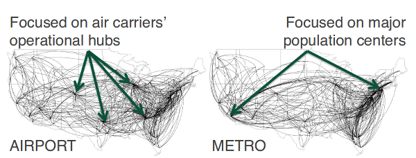
While trawling for interesting dynamic network datasets, I bumped into one about U.S. airport passenger traffic aggregated by Zachary Neal.. I lifted this image from his slides (p.9):

These data contain annual U.S. air traffic flow networks from 1993 to 2011. They were constructed from Bureau of Transportation Statistics’ Origin and Destination Surveys using the AIRNET program
What I thought was cool is that he constructs the network in two ways: one is the passenger flow between specific airports, the other is total passenger movement between metropolitan areas (if I’m reading his data correctly). He claims the first approach yields a hub-spoke network driven by airline hubs, while the second highlights travel between dense population areas. Both are derived from the same data. I think it shows how important it is to think carefully about how to construct networks that correspond well to the phenomena being studied. Are we interested in relative traffic between cities, or in the the actual flow of people (via roads, airports) between the cities? In hindsight, its obvious that these are very different networks (the first one for example should be nearly fully connected, right?).
I’m assuming that there is some thresholding going on in these images, ’cause the dataset he provides seems to have lots more edges in it.
