
I finally had a chance to pull together a bunch of interesting timeline examples–mostly about the U.S. Congress. Although several of these are about networks, the primary features being visualized are changes in group structure and membership over time. Should these be called “alluvial diagrams”, “stream graphs” “Sankey charts”, “phase diagrams”, “cluster timelines”?
James Moody and Peter Mucha’s Portriat of Political Party Polarization (in the new Network Science journal) plots the network modularity score of structurally-equivalent voting clusters in the Senate co-voting network as they change over time. The lines show the movement of Senators between clusters over time.
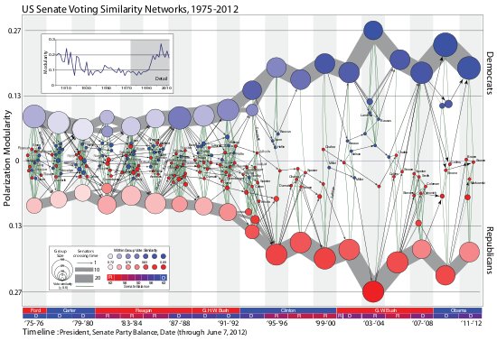
The figure maps this dynamic coalition network, one two-year Congress at a time. Nodes indicate structurally equivalent positions, scaled by number of Senators and shaded by their voter agreement level. In each period there are two “party loyalist†positions, anchored on the y-axis proportional to the modularity score. The y-position of other nodes—usually individuals—is based on the balance of their votes relative to these anchors. Positions are linked over time by identity arcs connecting each person to themselves over time, labeled to trace individual careers (the widths of arcs between aggregate positions indicate the number of people moving between them over time).