
Saw this Reddit Visualizer, a interactive network map of recent cross-commenting relationships between forums.
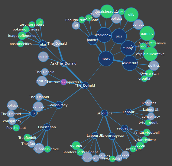
…wider lines represent stronger connections and connections are determined by shared Redditor activity. Specifically, for each subreddit we gathered the hottest fifty posts at the time data was gathered, and checked the last 100 comments of each redditor who made those posts. Each post made in another subreddit by that redditor counted as a single point towards that connection.
The Reddit Viz team has a detailed blog post on how they built the tool.
I’m not familiar enough with Reddit culture to really asses if the network maps give a good depiction of the community structure. There certainly are some oddities, like in the example above, why are there 6 different nodes for ‘The_Donald’ subredit? Sounds like that may be intentional:
As a group we also had to decide the fate of nodes that are already present on the graph and whether or not they should be represented more than once. Again, we ultimately decided to exclude subreddits over 11,000,000 and decided to show them as grey-blue nodes to give a more complete picture of subreddit connections
The viz part was built with D3. As always, I’m wondering why we need to watch the physics algorithm in real time do a mediocre job of network layout? :-)