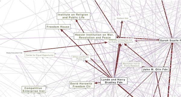
I’m interested in making political structures visible. Trying to put those half-realized connections and linkages into a tangible form–a map that we can point to. I recently located an online database of conservative funding relationships created by Media Matters Action Network. I was able to scrape the site and (with their permission) experiment with some network diagrams in pdf form to visualize the funding relationships among “angel investor” foundations and right-wing organizations.
Continue reading Angels of the Right v1.0
Monthly Archives: August 2010
Many Brands of Bubbly Bottles and Cans
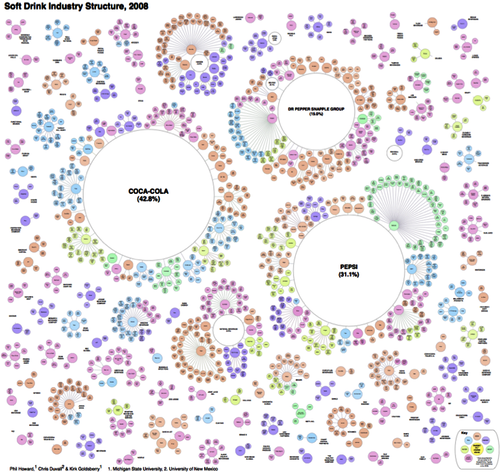
… but only a few owning companies. Another great study and diagram of brand ownership relations by Philip Howard.
…To visualize the extent of pseudovariety in this industry we developed a cluster diagram to represent the number of soft drink brands and varieties found in the refrigerator cases of 94 Michigan retailers, along with their ownership connections.
Although, according to the Soda vs. Pop map, since the study was in Michigan, maybe it should be labeled “Pop” not “soft drinks”? ;-)


