
It is still very rough, but I’ve been having a very interesting time looking at contributions among PACs in FEC Data. This image shows transactions to Senate candidate’s central committes that were reported in May of 2006. Colors by party, grey is unkown / unspecified. Labels are on candidate’s committes, but some are violently truncated. Names of PACs have been removed to protect the guilty (actually because they are too long and make the graph cluttered)
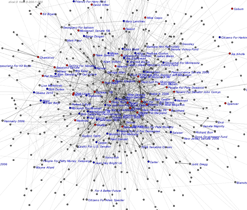
They layouts are not converging very well, so the structure is not that accurate. This is also only showing one month’s data, so not very representative. But need much more specific queries and good aggregation rules to deal with longer time periods. Easy to imagine making it interactive, zoomable, animating the time data, adding to SNA metrics, etc. A long ways to go to build software to do this, but I’m excited to have something to show!