In which I make timelines and network diagrams to illustrate relationships in a web soap opera. (This is what happens when a data geek watches YouTube with his wife :-)
Backstory
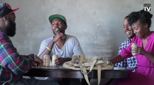
A few years ago, I was introduced to a genre of YouTube ‘webisodes’. It started with a few funny shorts about everyday life from the The Couple, and next thing I know we are trying to keep up with the overlapping plots of the collection of low-budget soap operas that morphed into the Black&SexyTV network. It didn’t take long for us to notice that some of the characters appeared in multiple shows, and some scenes seem to have been shot from multiple perspectives. Then we saw the “third wall” begin to crumble. The plots of the shows — already documenting the lives of the Twitter Set — began to respond to real-world social media activity. Apparently, when active YouTube comments indicate a lot of viewer interest in a specific character, the writers will often fork the character off into their own mini-series.
For example, Mike and Judah appear in a domino game in The Couple, and then suddenly show up filming themselves as stars in That Guy. So a character’s supporting roles become their backstory, creating an intriguingly non-linear universe of characters. Of course, to be able to understand this, we are going to need some data…
Some Data
Turns out IMDB has per-episode character and cast listings for the shows, so wasn’t too hard to pull that into a spreadsheet. Looking at the data, I realized that IMDB had some errors and omissions, some of which I corrected by copy-pasting from the series’ YouTube pages, but it is probably not complete. (Feel free to suggest additions and corrections!) This gives a table of characters, listing each episode they appear in.
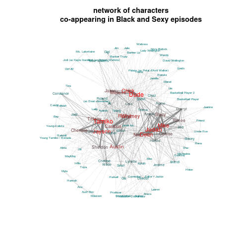
I wrote some R scripts to process the data in various ways. First I wanted to see a network of character co-appearances in episodes. This is sort of like a proxy for the characters’ social networks — one with strong sampling bias due to the plot focus of each series. Of course it would be more accurate if I had scene-by-scene breakdown, but that would require re-watching the entire thing…
The Social Network
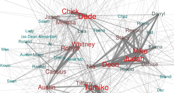
In the time-collapsed network diagram (svg version), character labels are sized proportional to the number of episodes they appear in, and the width of the lines connecting the characters are proportional to the number of episodes they appear in together. For example Tamiko and Jayson are drawn next to each other with a thick line between them because they are in most of the RoomieLoverFriends shows. It is almost like there is an invisible force of attraction drawing them together…
There are clear clusters in the diagram corresponding to each of the series that I pulled in data for. Also interesting to see how central the Nia character is, especially since it sounds like she’s about to have her own show.
The networks seem to bleed a bit over into real life, as some producers make cameos, some characters shoot video, and in later episodes of Yellow (which focuses on the Austin character), the producers appear as themselves.
The Subway
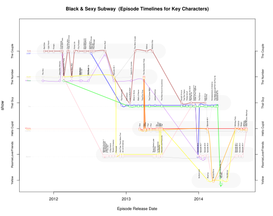
I found that I was thinking of the series’ as clusters of narrative threads for each character, some of which jump back and forth between shows. So why not try the relationship timeline techniques? Can we construct something like the XKCD movie narratives for this expanding universe of characters?
The problem is, I don’t know how Black&Sexy time works. Some episodes are in a clear sequence, but for most it is hard to know exactly what happens when. So for this first draft I’ve assumed that time in the Black&Sexy universe moves parallel to our own, and used the release date as a proxy for episode sequence. (click through to larger svg version)
It quickly started to look like a subway map (‘tho an oddly linear one) so I tried to follow the graphic style a bit, labeling the episodes as “stations” where the various character’s interact while their lines cross between the “islands” of each show.
However, its clearly not perfect. The Exes and Texts The Couple episode takes place at the The Number‘s Engagement Party. Although you can see the characters jump back and forth, its not evident that they are at the same time and location.
I only included the major characters for this timeline (plus few minor ones that jump around a lot). Otherwise I need a much better layout algorithm to deal with optimizing the parallel threads to prevent confusing overlap. Of course this could be done by hand for a print version, but I’d like to be able to regenerate the plot automatically as new episodes and shows are added.
It would be fun to expand the dataset to include some of the crossovers from other shows and cameos. For example, Issa Rae — who runs her own series and seems to be closely connected to the actors and producers in real life — appears frequently as various characters. Not sure how to illustrate this. And when Jeanette Daniels appears as a food server in an early The Couple episode, is she playing Deon, or is she just an extra?
It is pretty cool that video technology has gotten to the point that a bunch of people with skills can get something of this quality off the ground without a studio– and then turn to their viewers for support with various strategies (crowd-funding, fees for season finale, etc) to keep it going. Clearly it takes a ton of work. If you look at the timeline, it seems that only so much multi-tasking is possible. The gaps in releases of one show seem to mostly correspond to work on another. And some shows have been killed off (via user polling) so they can concentrate on the more popular ones. It is a really cool model, both for film-making in the modern age and for telling stories that haven’t yet made it into mainstream TV. Perhaps that will begin to change, as The Couple has been picked up by HBO.
Hope to find time to do something more interactive with this data, make it so clicking on episodes will play them, etc.
I will leave you with my first and favorite episode:


Just bumped into this lovely D3 example that does narrative timelines based on comic book annotations: http://csclub.uwaterloo.ca/~n2iskand/?page_id=13
Cool. What software did you use to make the network diagram with? It is very readable while information dense.