Gives an interesting perspective on who might stand to benefit from the current proposals: probably not those of us who are uninsured. Starting to seem pretty unlikely that we will get a reasonable single-payer plan :-(
The main conference on Social Network Analysis was is in San Diego this year, so I decided to make a trip down. Was nice to step away from the screen and see old and new faces from the far-flung research community. Amusingly, the conference landed in the middle of spring break celebrations, so there were bearded academics wandering geekily around in crowds of drunken sunburnt 20-something revelers.
I gave a presentation at the very tail end of the conference to demonstrate some features of the oilmoney website—including a presidential contribution movie, and bit of analysis on the data. Much of this will be familiar to anyone who has read theseearlierposts, but the stat stuff is new. Warning: the rest of this post is pretty geeky, read at your own risk ;-)
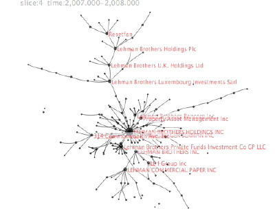
Dan Newman, director of the money in politics watchdog/transparency site MAPLight.org kindly shared some of their bill endorsement data for me to explore. In addition to providing an elegant interface for accessing California and U.S. Federal campaign contribution data and voting records, MAPLight’s interns do extensive research to determine various organizations positions on bills that are being voted on in Congress. These endorsement and opposition relationships can be thought of as ties linking the organizations to the various bills they take a position on. The ties can then be assembled to form—yup, you guessed it—networks of bills and their supporters. My hope is that giving the bill data a relational treatment might reveal some of the coalitions and give additional context for each organization’s position. Continue reading Digging into MAPLight.org’s Bill Endorsement Data→
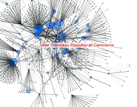
I’m very interested in trying to figure out ways to map the political landscapes and power structures that are operating around us. I’d like to be able to see various organizations and political actors in the context of their allies, enemies, and supporters in order to understand where the political boundaries are between various factions. Continue reading San Francisco Political Contributions→
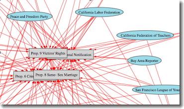
It is election day! Fingers crossed…. ;-) Before today I was searching for various organizations’ endorsements of California ballot measures. Finally located some data, and was curious how it would appear as a network showing the organizations and the propositions they support. Was able to scrape data for University of Berkley’s IGS Library Ballot Measure Endorsement page (for Nov. 2008) and create a few network images.
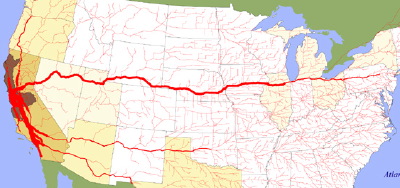
Found this fascinating .gov site that gives visual maps of the freight flows between various cities in the US. Image above is just truck flows from SF/Oakland, but they have for entire states as well. Data is from 1998, most Department of Transportation sources . Also includes similar images for maritime flows and links to commodity flows data sources. Neat to be able to see the distribution network of dependencies connecting the regions like arteries or roots. As if each city extends its transit tendrils to other cities to gather and exchange the “nutrients” (products) it needs to survive. Continue reading Economic Flows and Vulnerability→
Despite the mobility and “small world” social connectivity people living in modern culture, regional difference in culture do seem to persist on both the nation and neighborhood levels. The Soda vs. Pop map may have been created almost as a joke, but seems to reveal very real regional divisions in word uses. Obviously, terms for carbonated drinks may not be tightly correlated with other cultural traits, but it is an intriguing image — and quite a relief after the deluge of red-state blue-state political maps based on voting districts. Continue reading Mapping Culture→


 Dan Newman, director of the money in politics watchdog/transparency site